I’ll probably be making a separate post… later on… about the various editions this particular story went through and see if I can scrounge up all of the photos I have of my previous copies. But, right now, I wanted to take this chance to go over the version I launched my first Kickstarter with.
As much as this particular story is a difficult sell and since launching the project on Kickstarter in 2016 I’ve learned an insane amount about self-publishing, book formatting, printing, marketing, all of the ‘ings’, it still holds a special place in my heart as one of the very first most serious stories I’ve self-published. I never start small I always go big or go home which is both a blessing and a curse.
For the sake of brevity because I can talk six-ways-to-Sunday about this particular project I’m going to focus a lot more on the artwork and writing around and in the story itself and less on the book and printing aspects which are a whole other ball of wax I will probably stick my fingers in on a different post.
But, okay. To start with, the covers. I… still really love these and I’ve always loved playing with opposites and colour schemes as a way to differentiate works but still tie them together in a set… er… here’s what I mean:
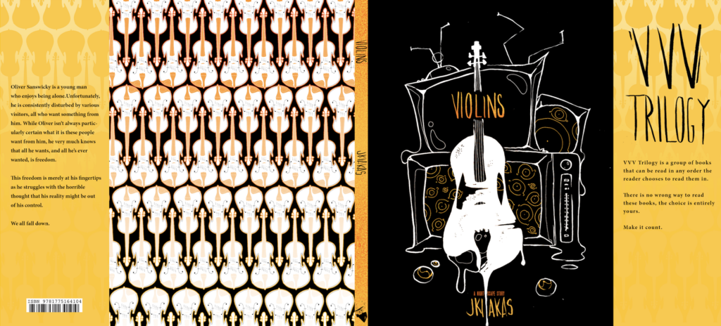
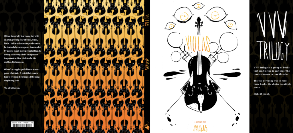
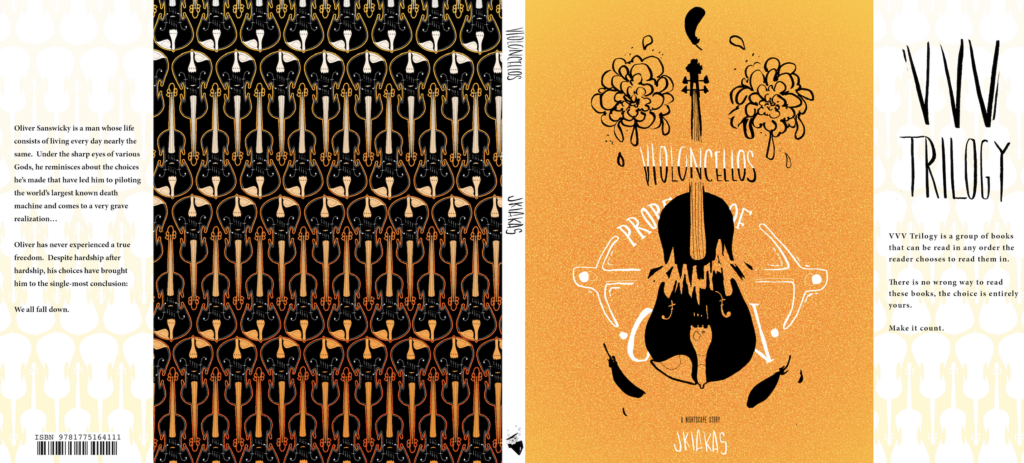
Because I was an ambitious freak, these covers were designed with french folds too. As old as they are I still really really dig the aesthetic of these books, all together they look really sleek.
So you pick up one of these books and you ask what the deal is with these. Often my tagline at cons is, “An illustrated trilogy you can read in any order.” And then you ask me what its about and every time I hesitate because, well its about a lot of things. It’s a mess. The story is an in-cohesive pile of stress, depression and anxiety about death and the world falling apart. But usually, I just tell people, “Its about a boy with bird feathers for hair who is a demi-god whose powers everyone wants for their own personal gain.”
And that’s not wrong, exactly because its a little bit about that too.
The story is about a mute boy named Oliver who constantly doubts himself because the world around him has decided that his voice doesn’t get to be heard. His talents and comforts are stripped from him at a young age, his step-father and brother turn his comforts against him in a testing facility that struggles to understand his magical ability–
No, the story is about a hermit freak in a cabin in an abandoned junkyard who spends his time tripping out on his own magical ability that he cannot seem to control anything in his life until the mayhem all piles up on his doorstep. Maybe he has heart surgery at some point–
But actually the story is about a demi-god who destroys the world with a giant machine built of junk parts and powered by his own magic but who eventually realises his role in the whole universe and decides to solve the problem himself…
(Just kidding, the story has all of that in it and more… it’s not perfect and clean and, somehow I’m going to be taking on the task of tackling it in a redraft …. one day. I’m working on that one now, actually).
But enough about the story, the books also have a zainy cast of characters all of whom I’ve illustrated before:
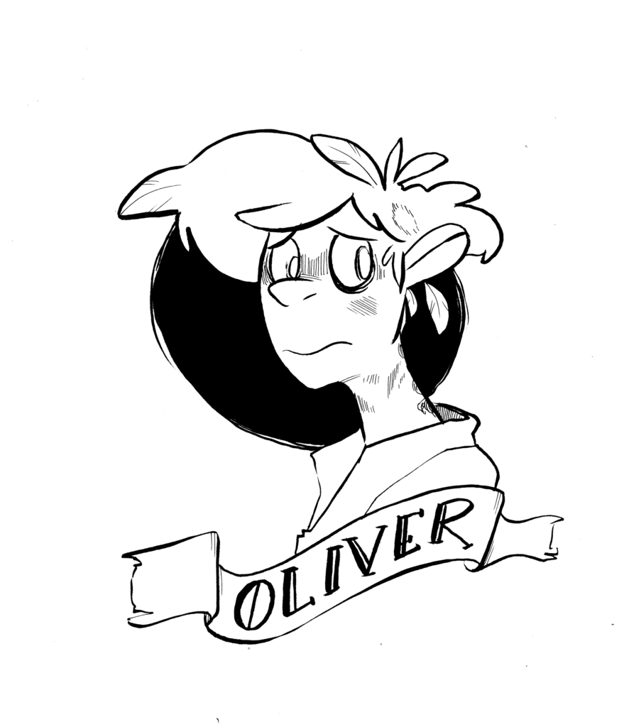
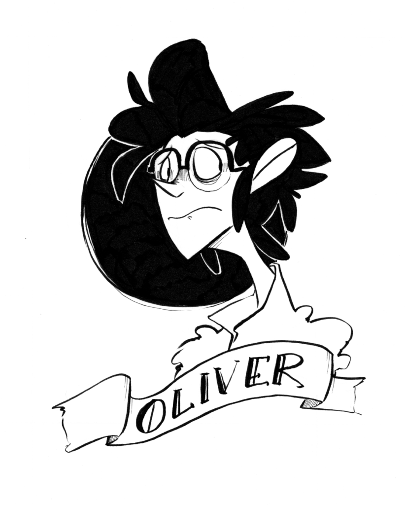
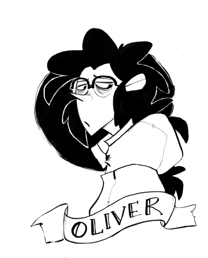
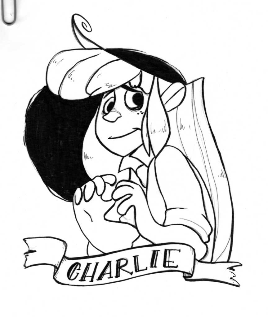
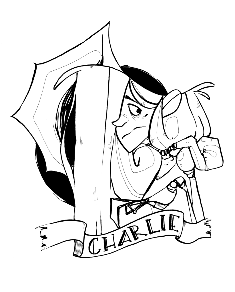
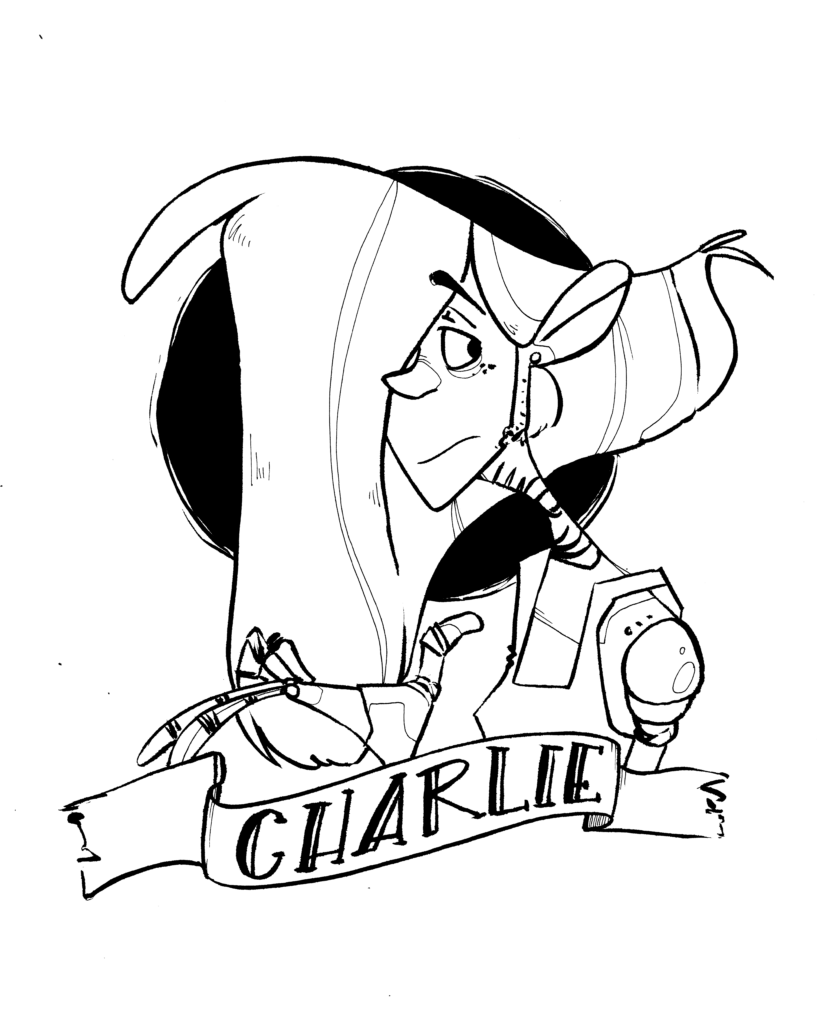
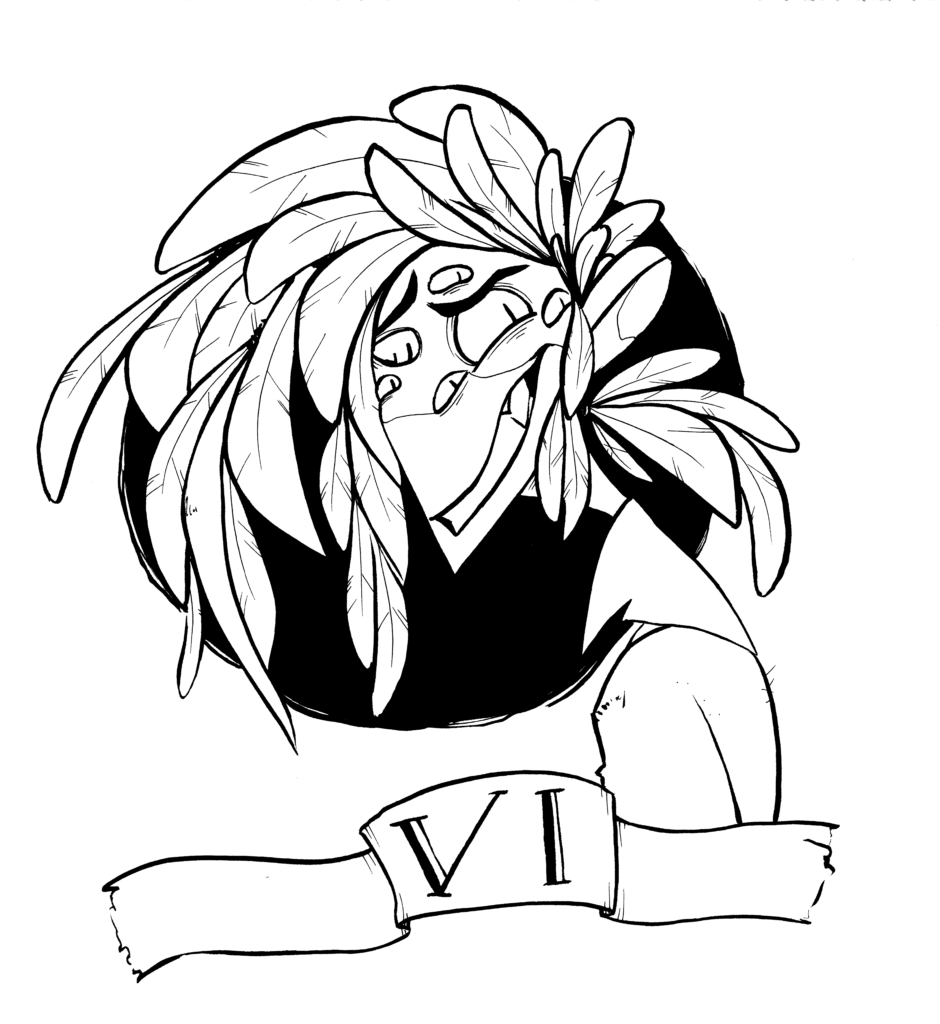
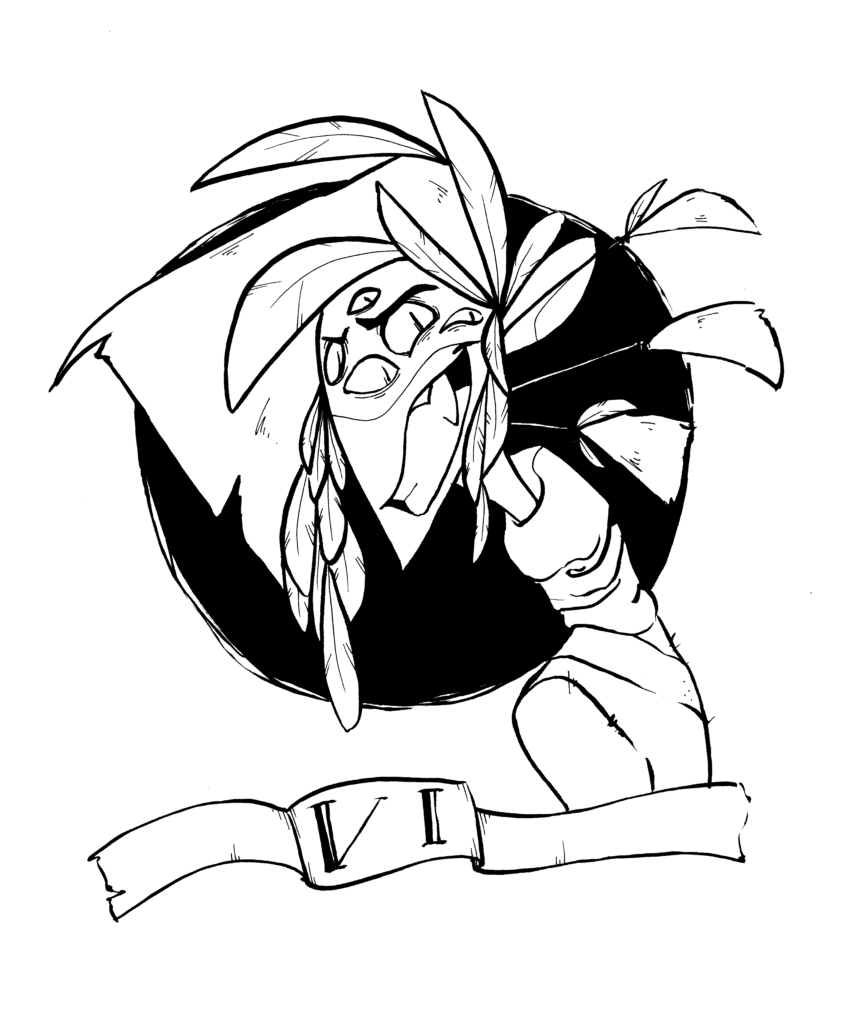
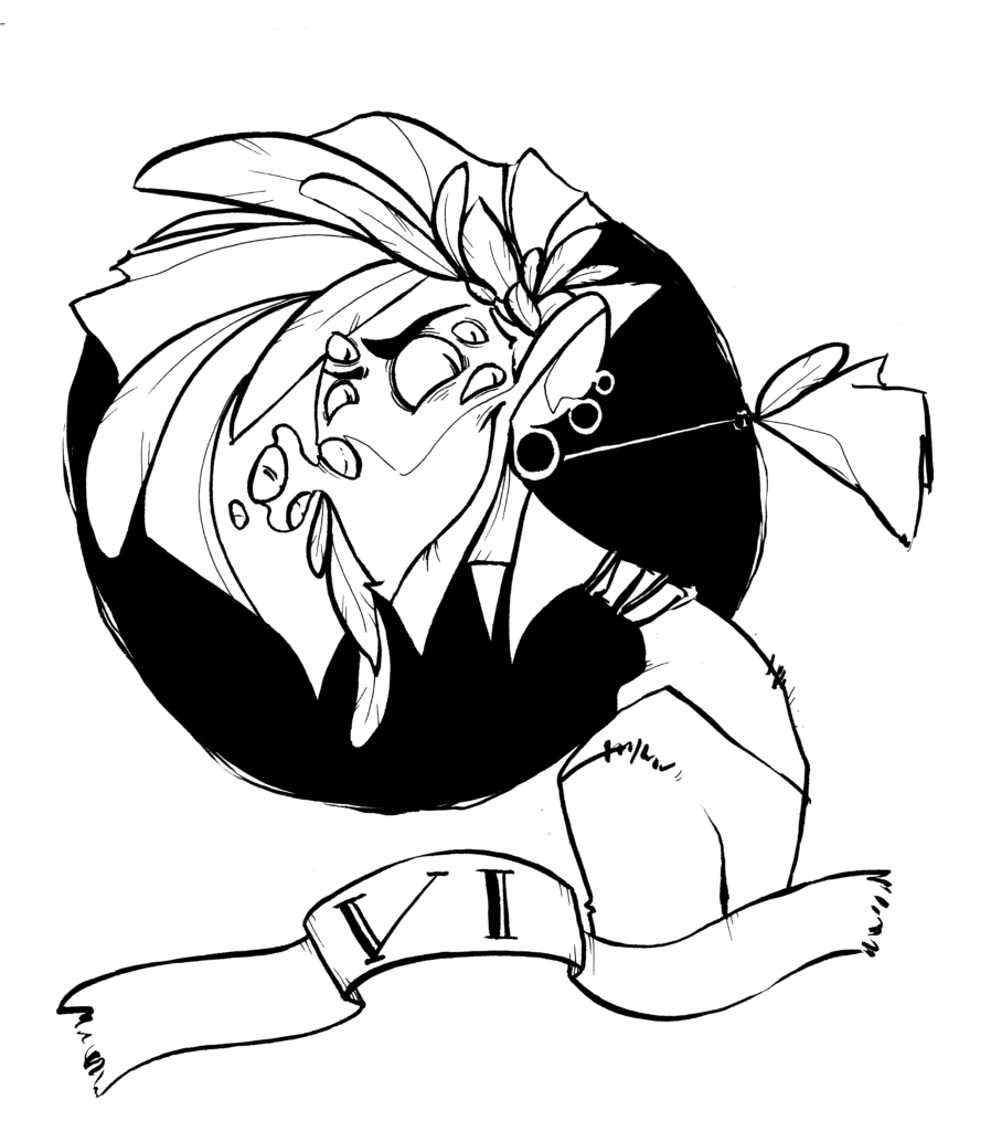
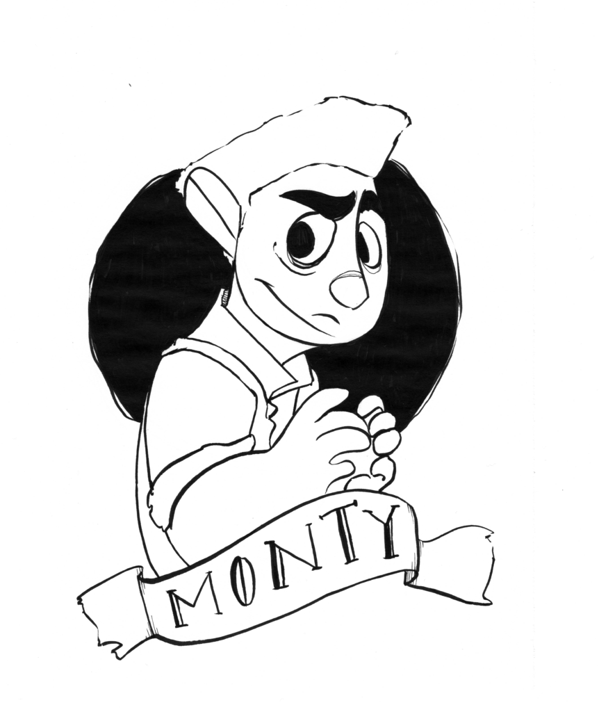
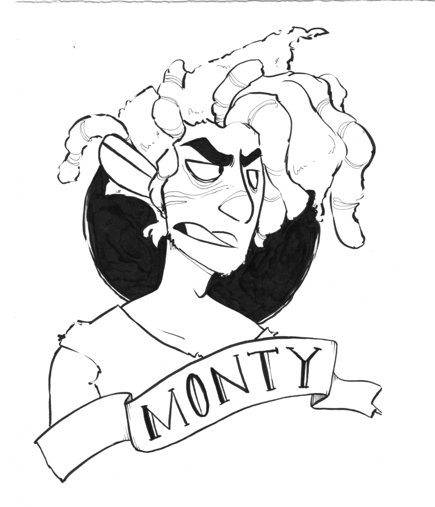
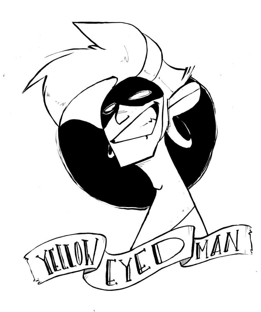

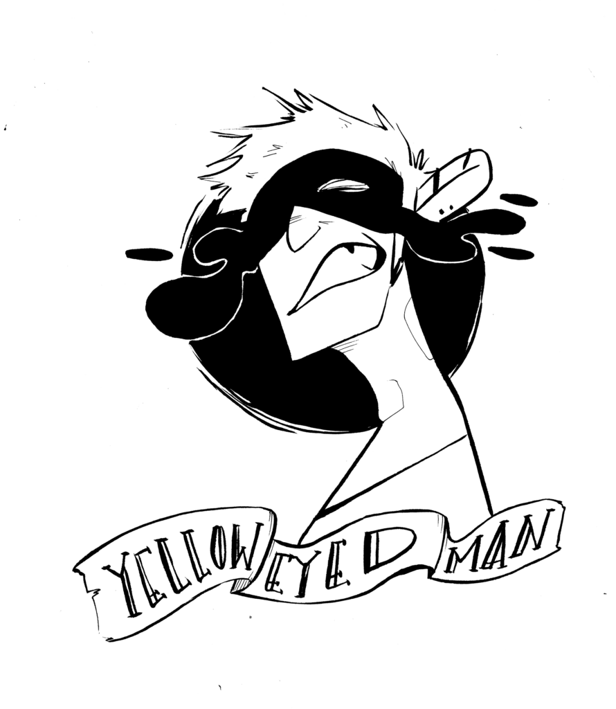
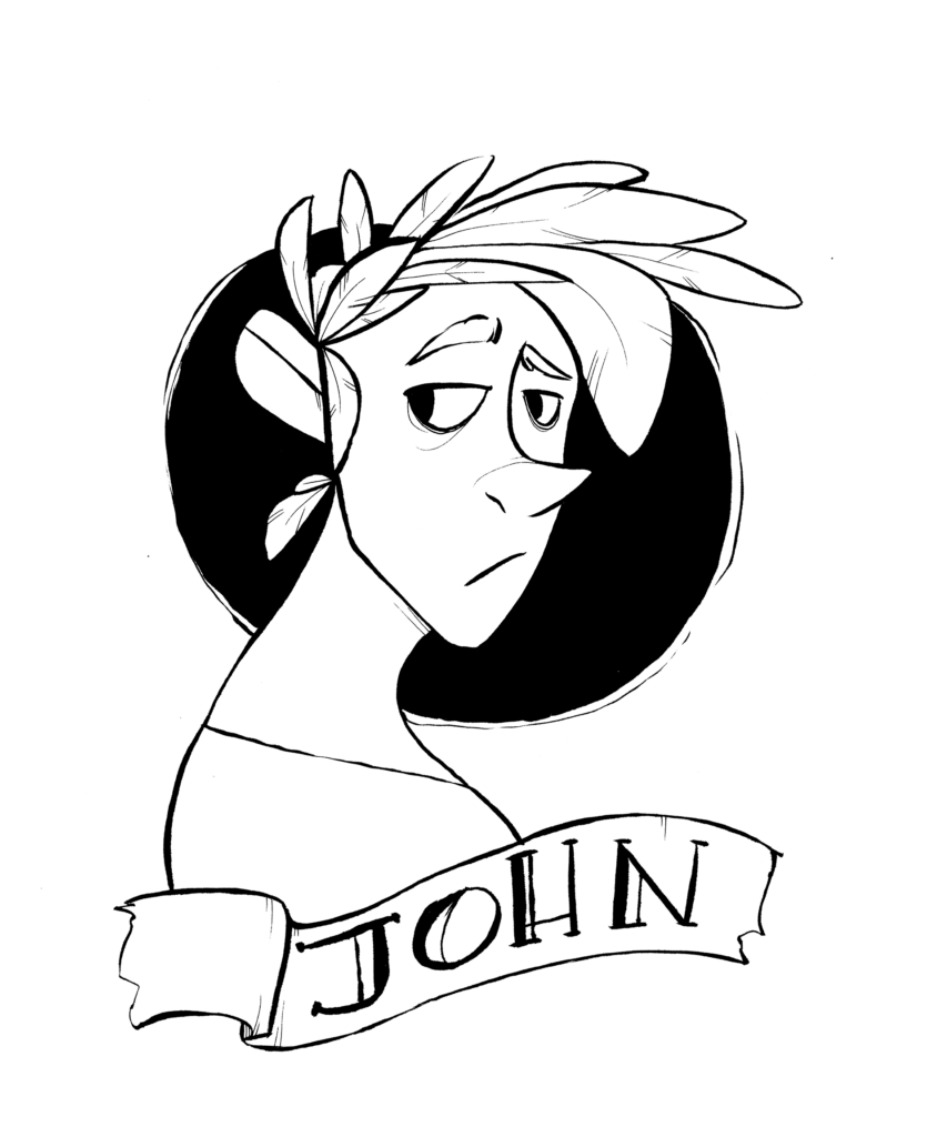
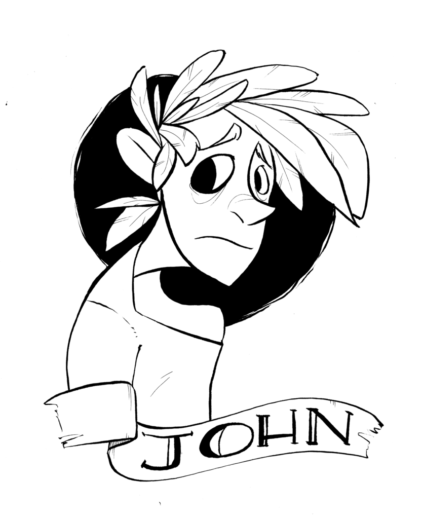
These were used as a character glossary/reference in the books. Some of these characters appear in all three stories, some in only two. The story also takes place over the course of Oliver’s life and he’s about 30 when it ends so I got to illustrate some of the characters in various age groups… and some who didn’t age at all because…. they’re gods.
It wasn’t nearly enough for me to take on the task of writing an entire trilogy and self-publishing it under my first Kickstarter time-crunch. But I also chose to illustrate all three of these lovely books.
I was, of course, also quite complicated with the illustrative portions. To start with I had long horizontal panels that served as character introductions within the narrative every time a new character was introduced, like this:
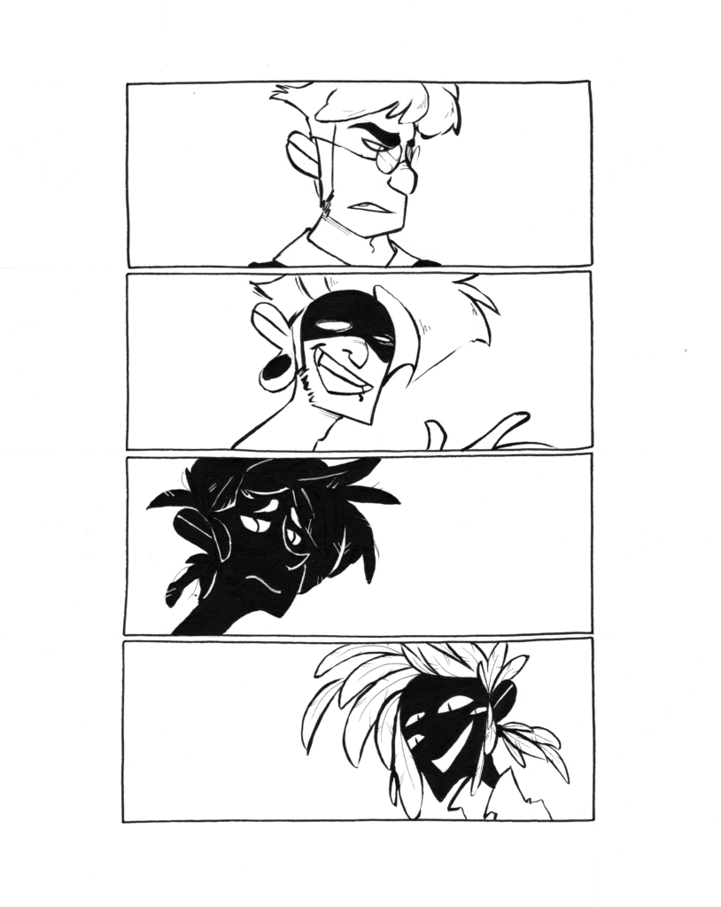
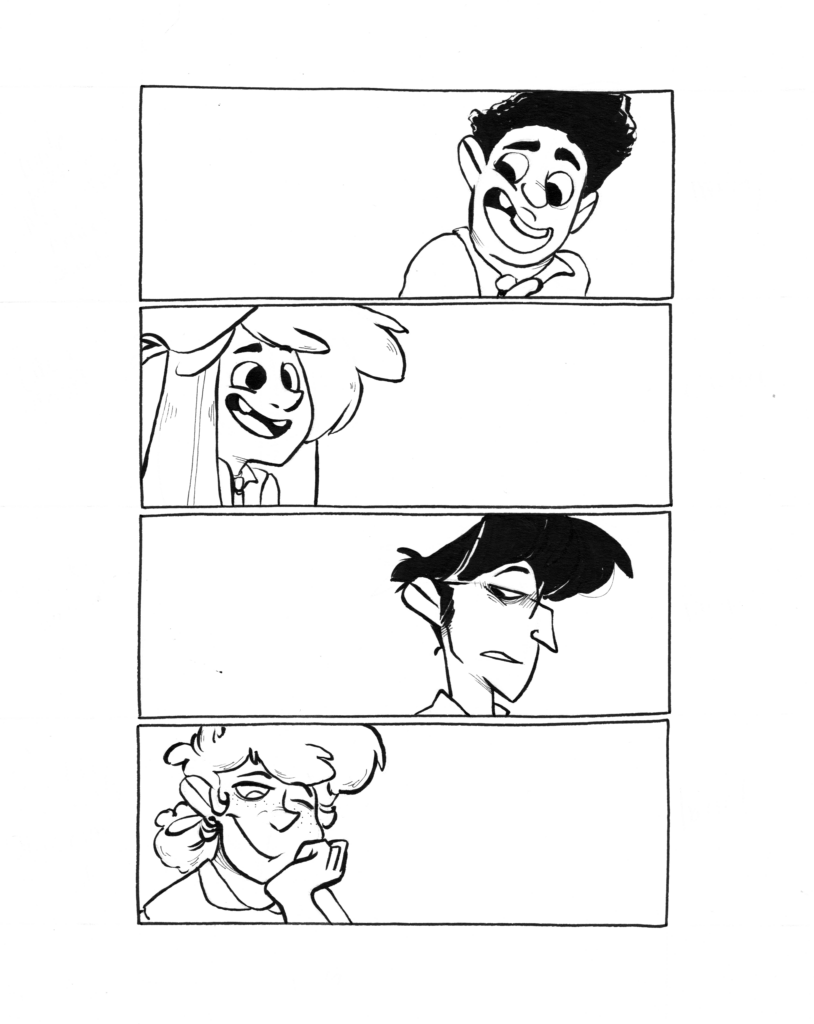
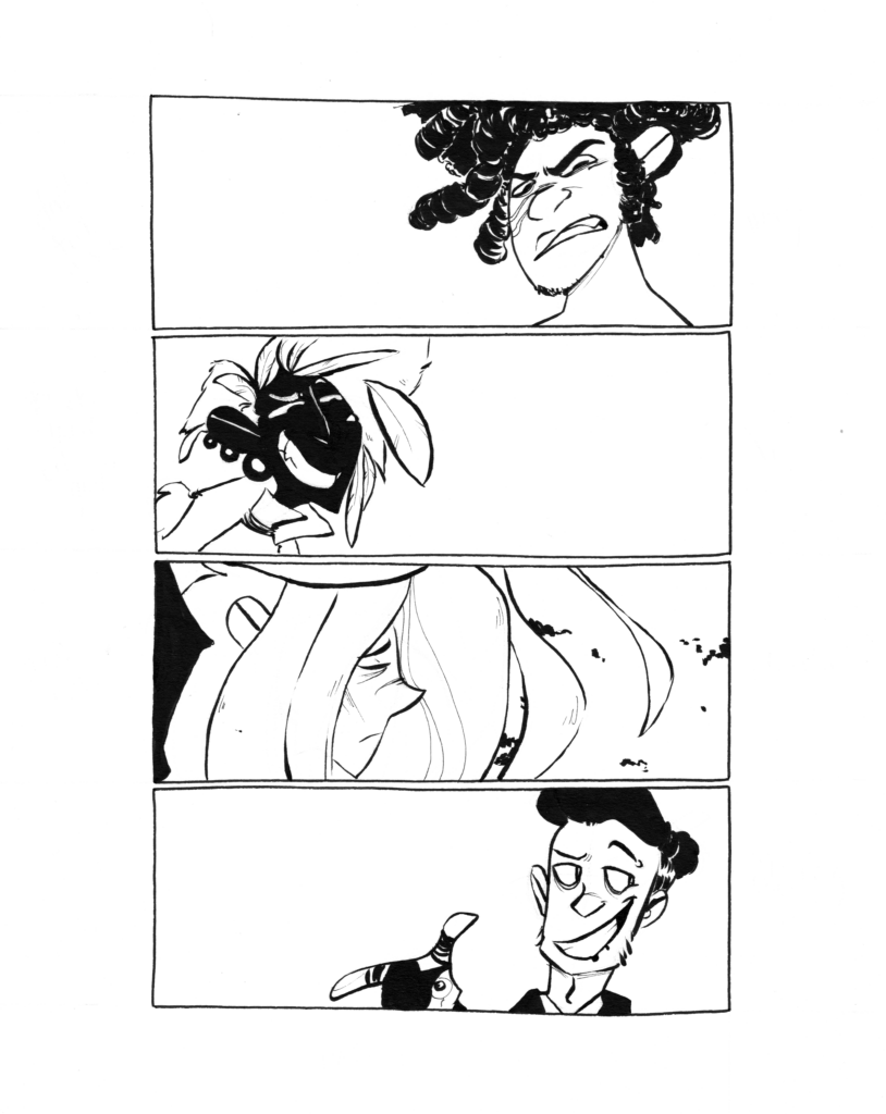
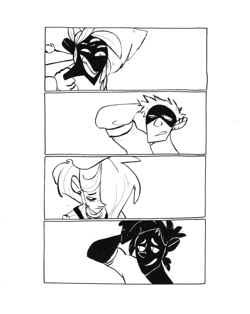
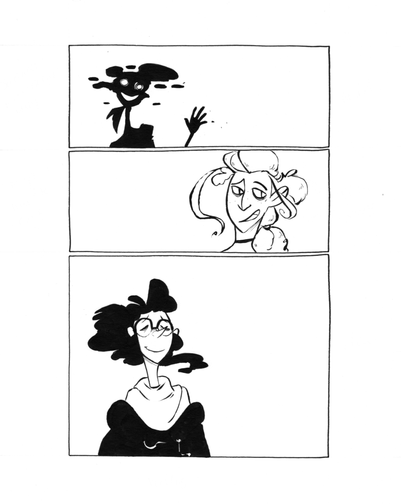
If there’s anything I could really take away from this its having character illustrations as introductions. I’m sure in the chaos and flurry of the story it was a welcome grounding point to have the image of the character correspond to their introductional image so the reader could clearly put two and two together. In some stories this trick might be a bit too obvious but as a stylistic decision in a maybe more snappy story these might have worked a little stronger. Definitely something I would like to try again with a bit more pizzazz.
Next, I had a few simpler, aesthetic panel-style images that were interspersed throughout the narrative to break up some of the text and the scenes.
These looked like the following:
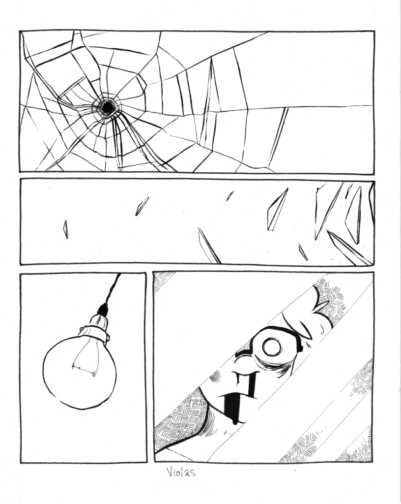
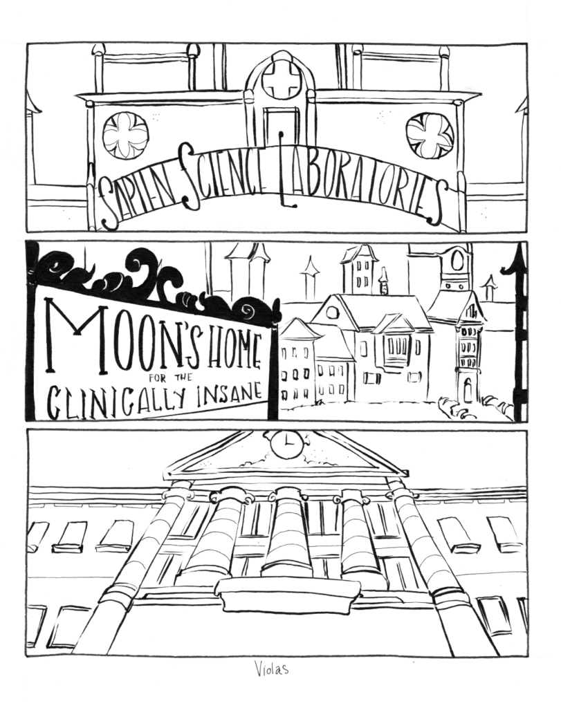
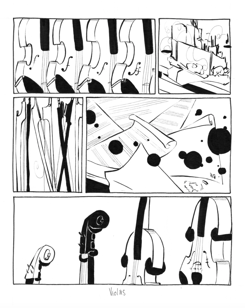
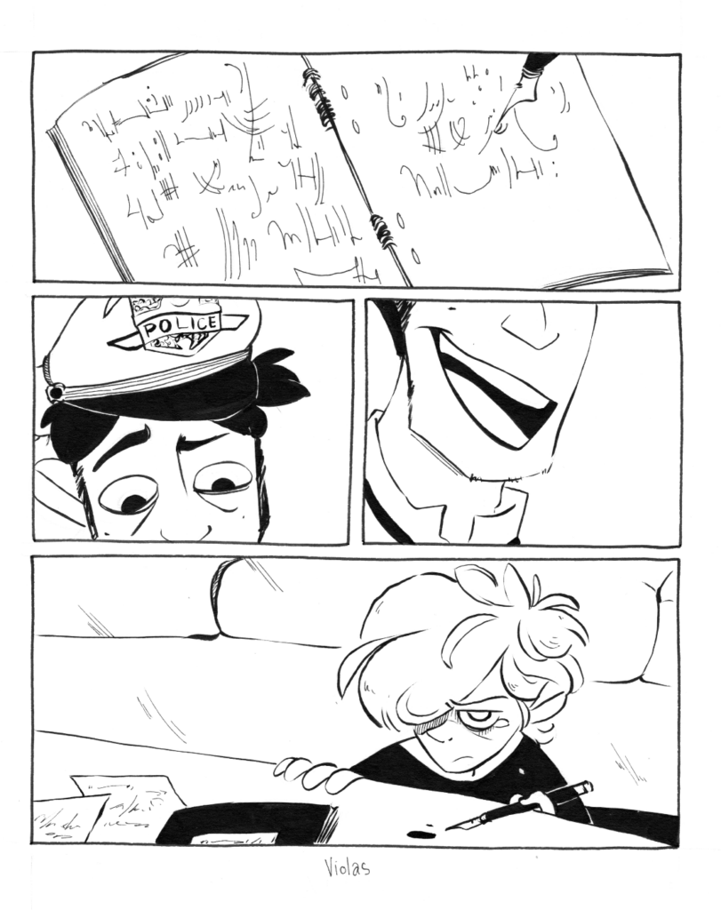
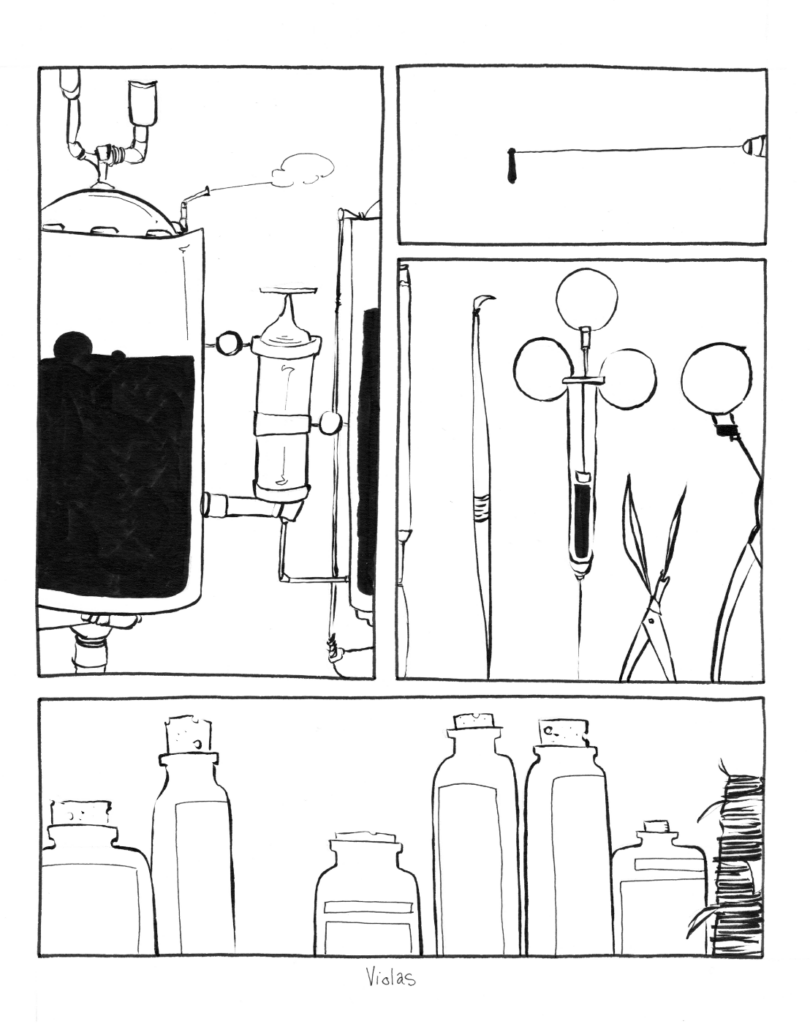
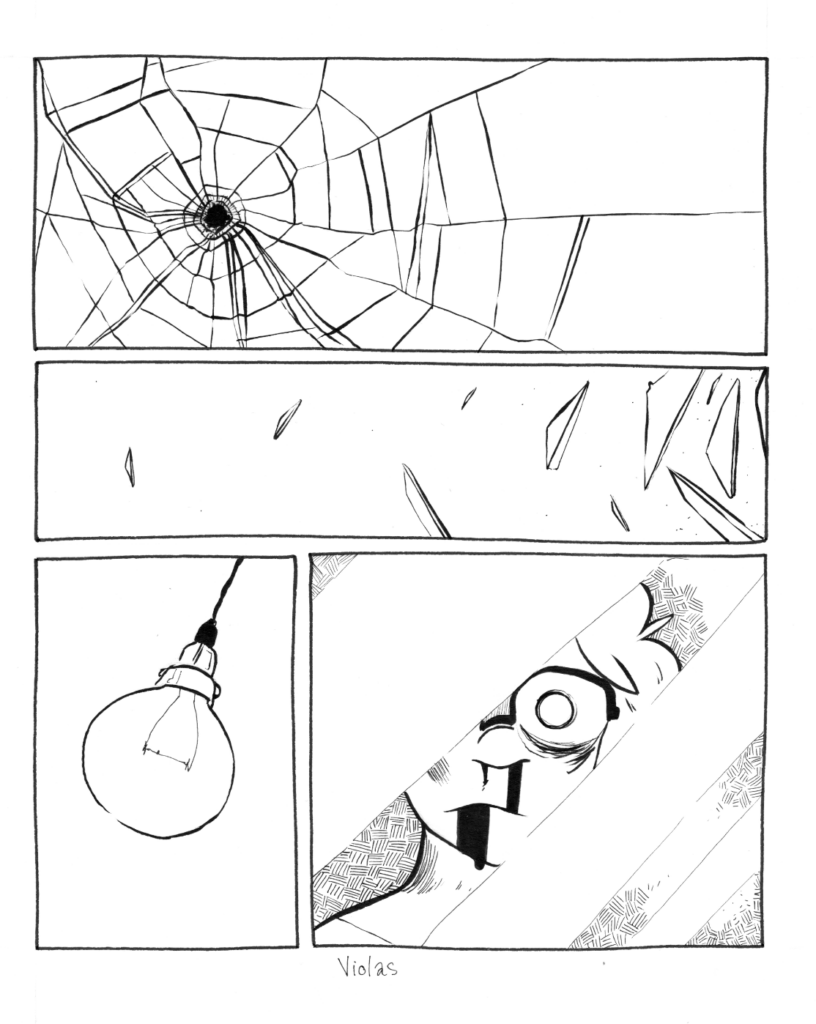

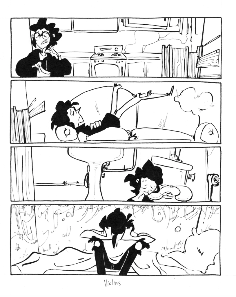
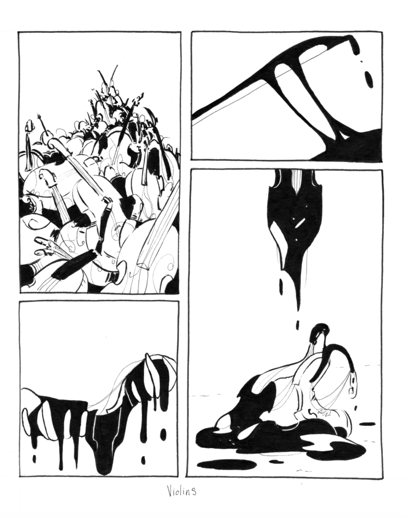
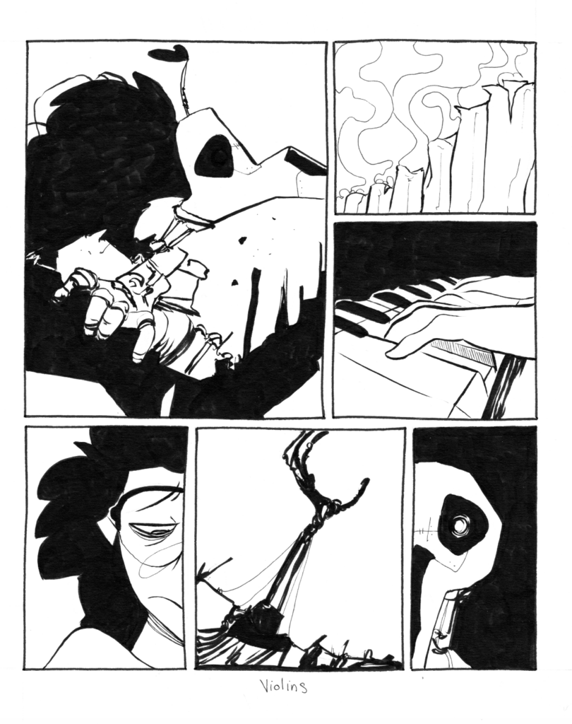
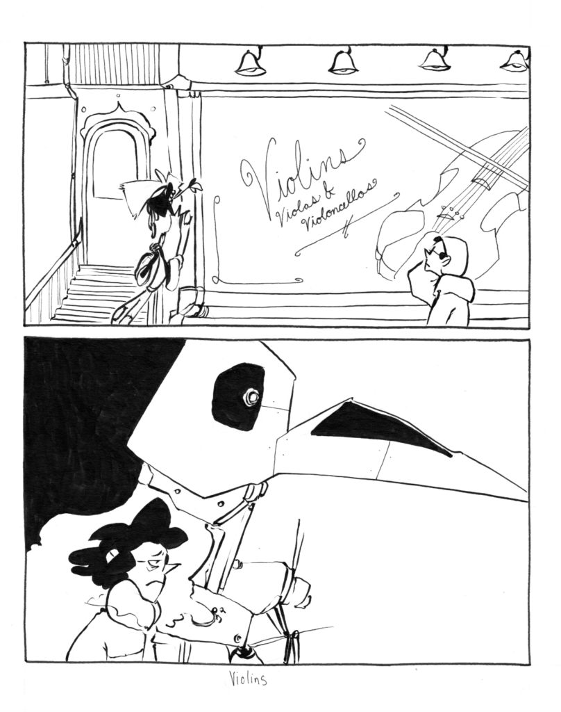
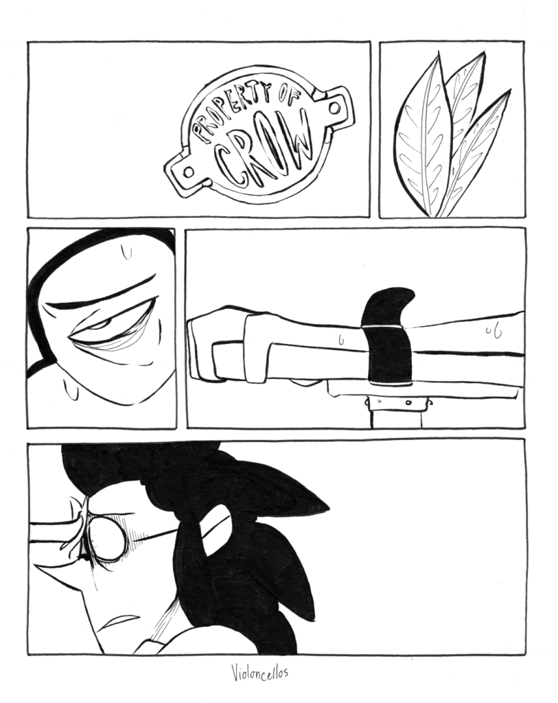
These were some of the weirdest parts of the project. I distinctly remember being rather disappointed with the way some of these images turned out but feeling too much pressure from the expecting Kickstarter backers to allow myself to re-do any of these or replace any of them. They were some of the last images I tackled for the project so I definitely remember feeling rushed through some of these both by my own anxiety and my own urgency. In hindsight I… don’t think I was giving myself enough credit where it was due. A lot of these really capture the moments of the story really well or display a patience with technique that I feel is sometimes lacking in my current work. It’s nice to see it was in me somewhere that I can pull back out again one day, maybe.
I do, however, think that I could have lessened the pressure on myself and taken some more time with formatting and pulling out a few more images for these books to really fill them with these moments.
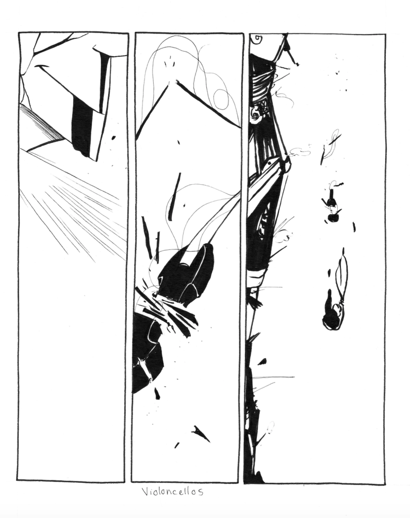
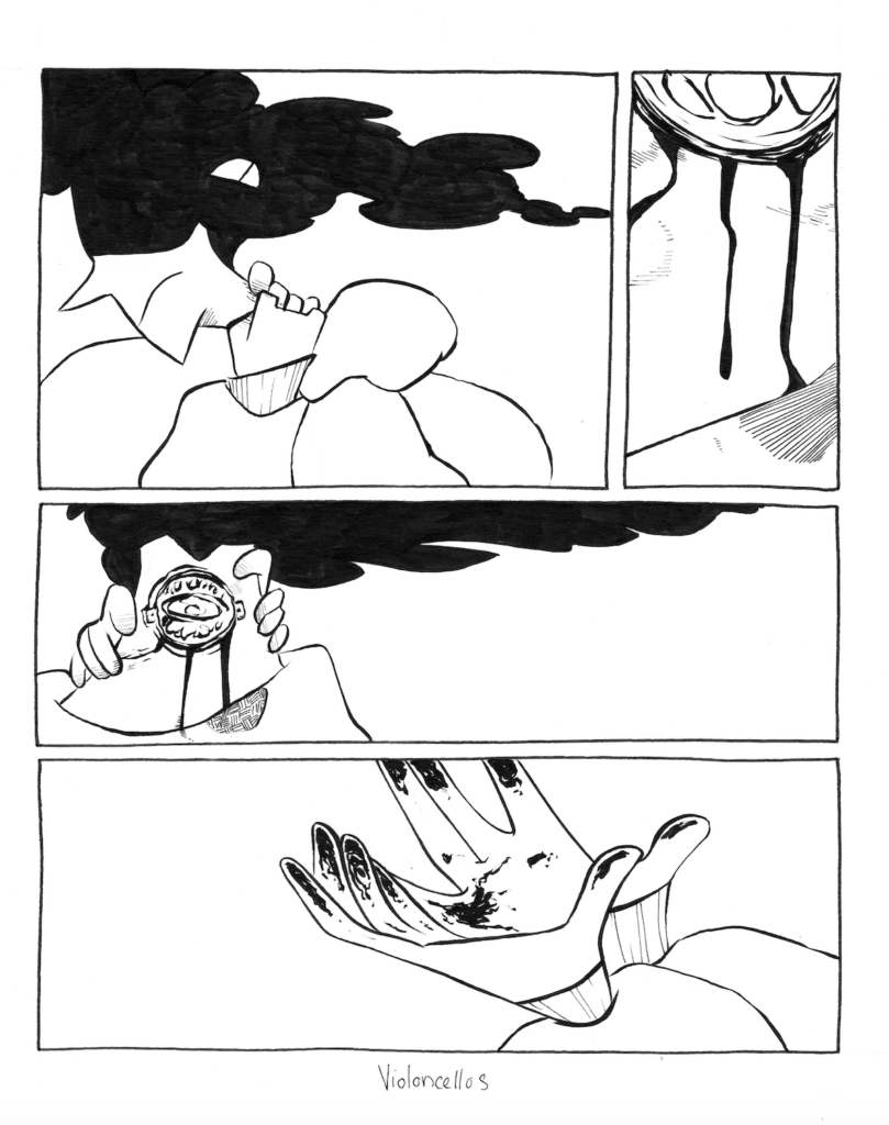
Another type of illustration was a series of storyboard style images I drew for the ‘trippy’ bits of the story (so anytime Oliver’s power took over and dipped the reader out of the narrative’s reality and into straight, fucked up metaphor). These wound up looking like this:
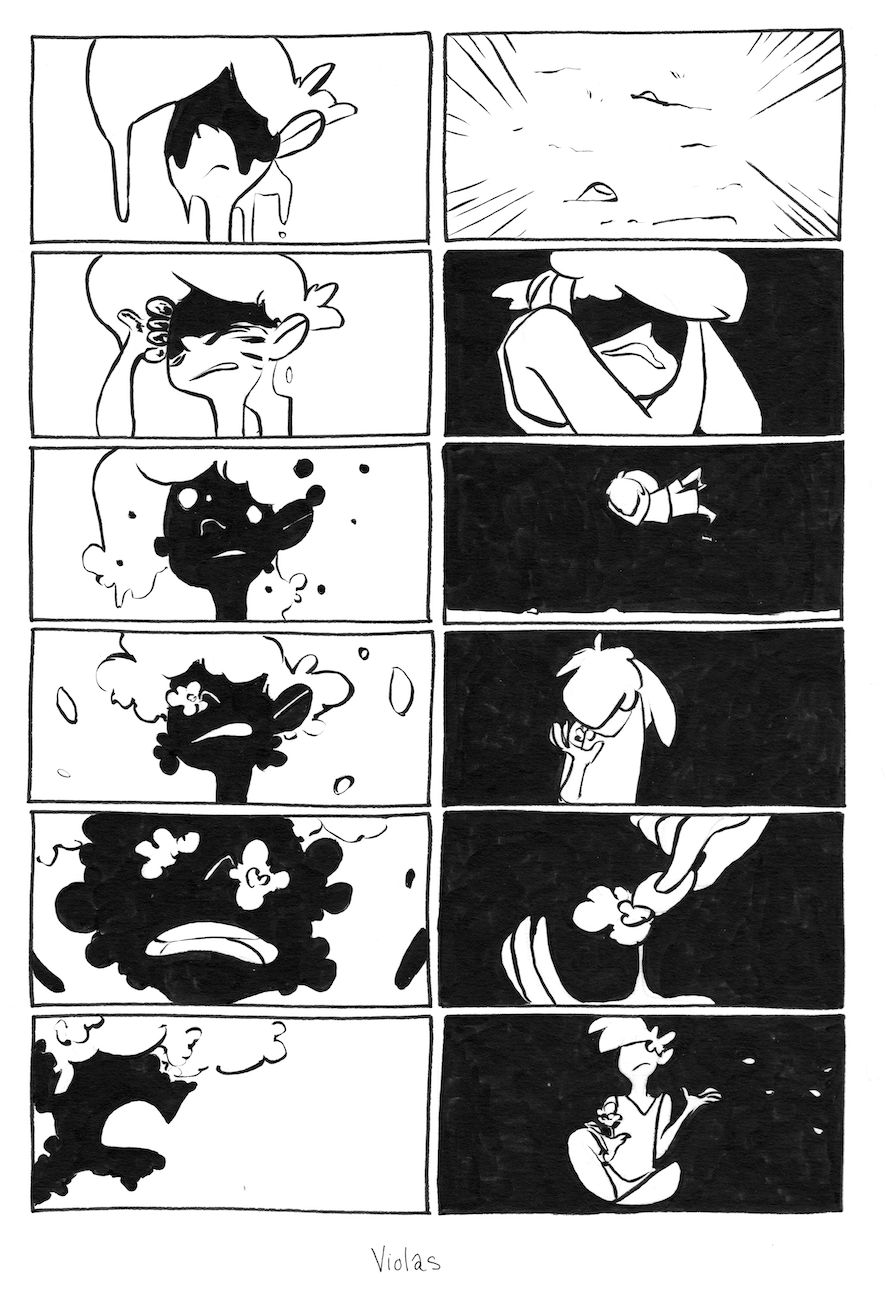
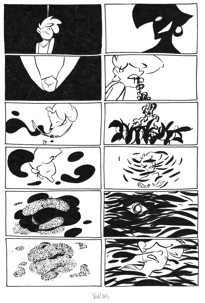
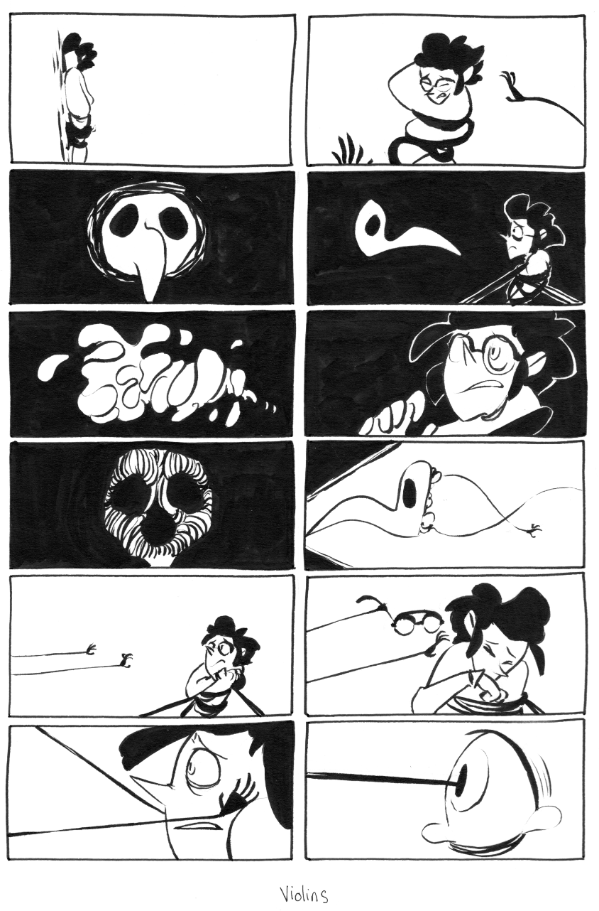
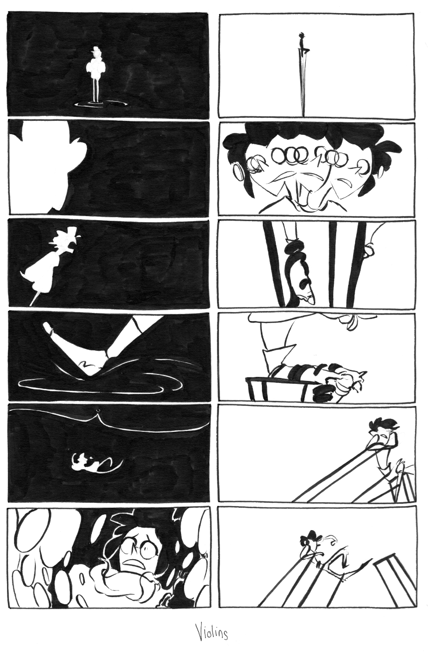
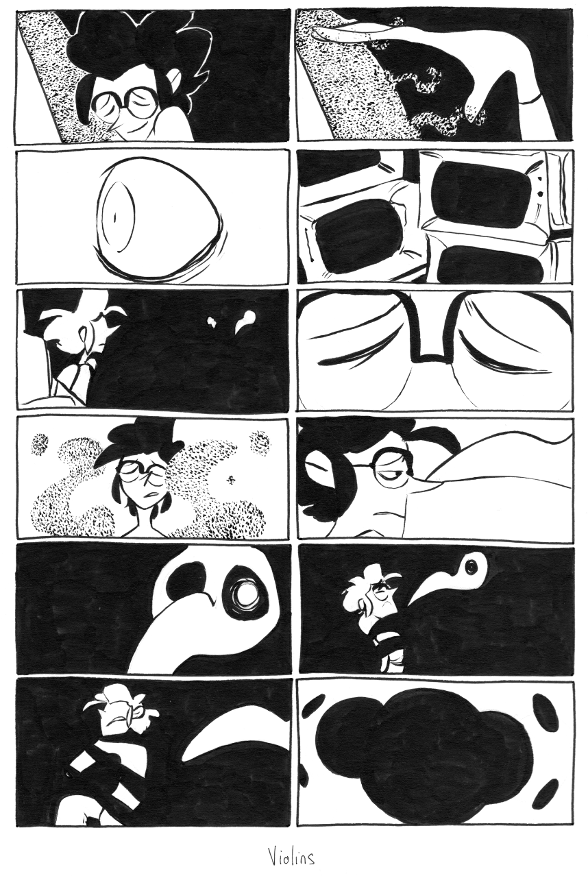
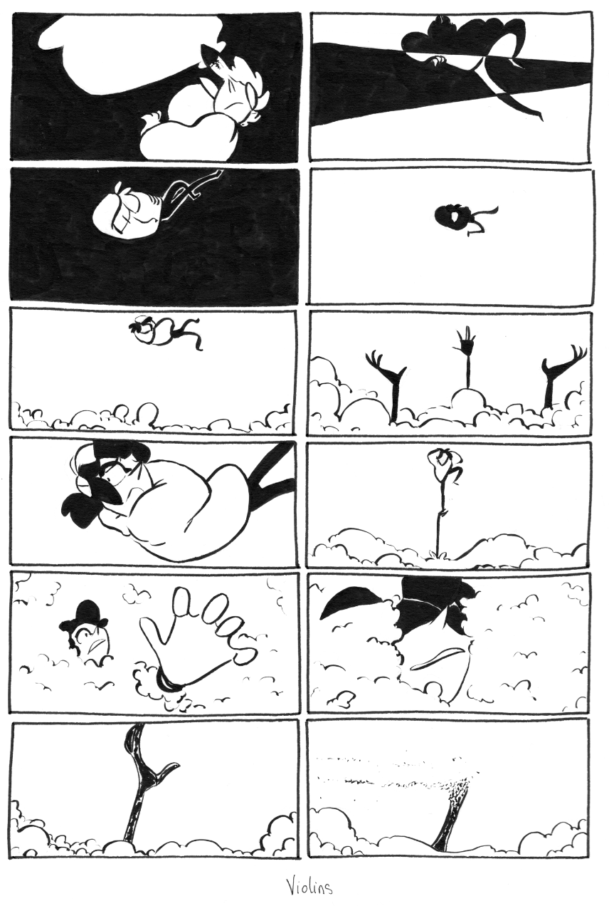
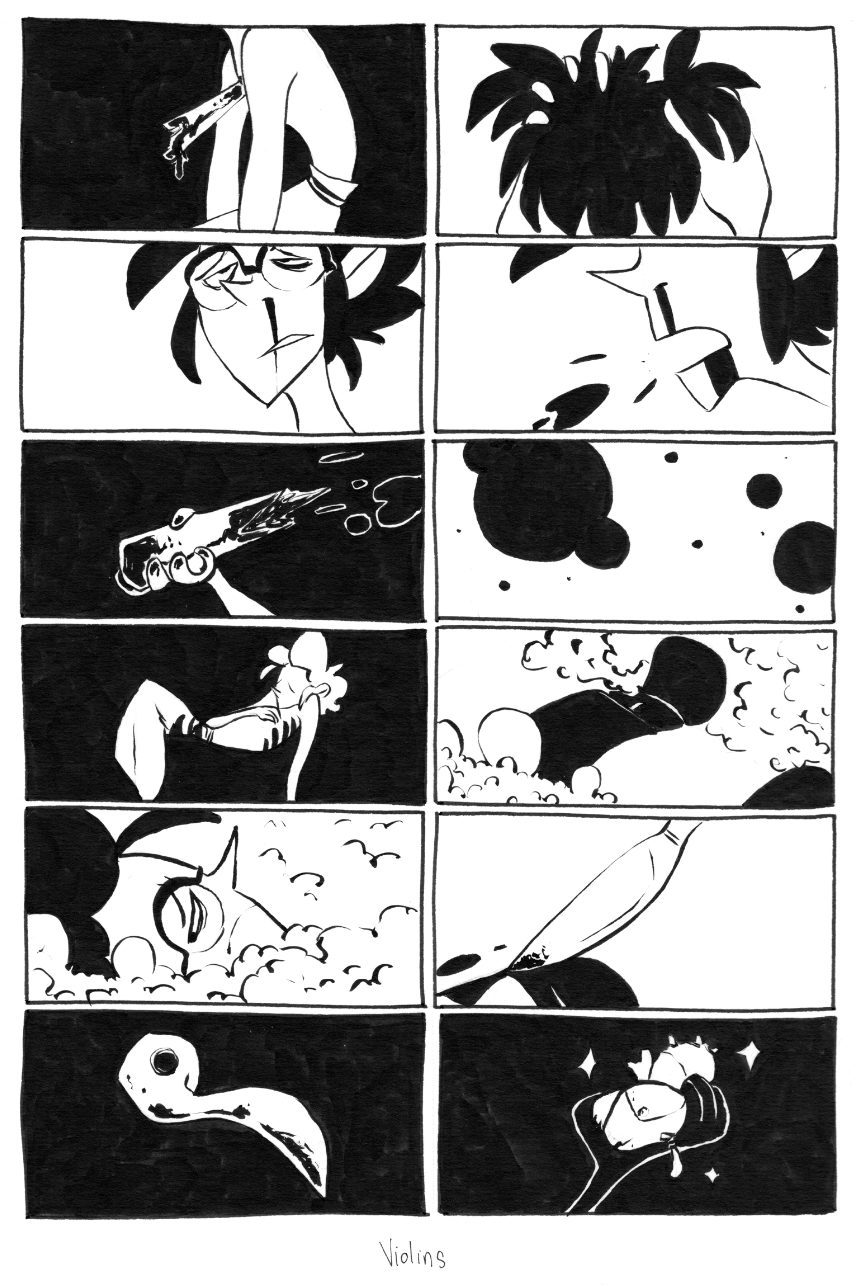
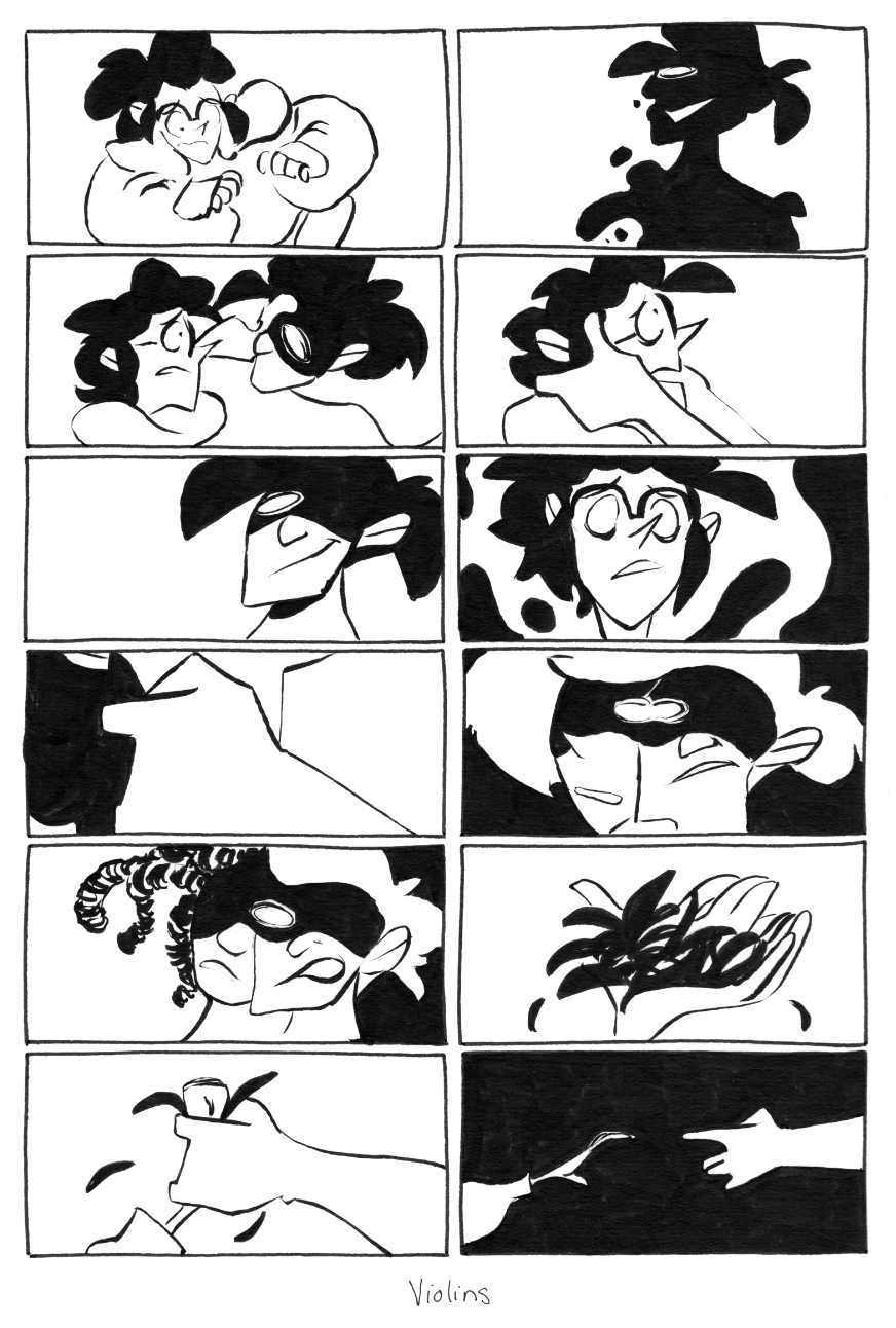
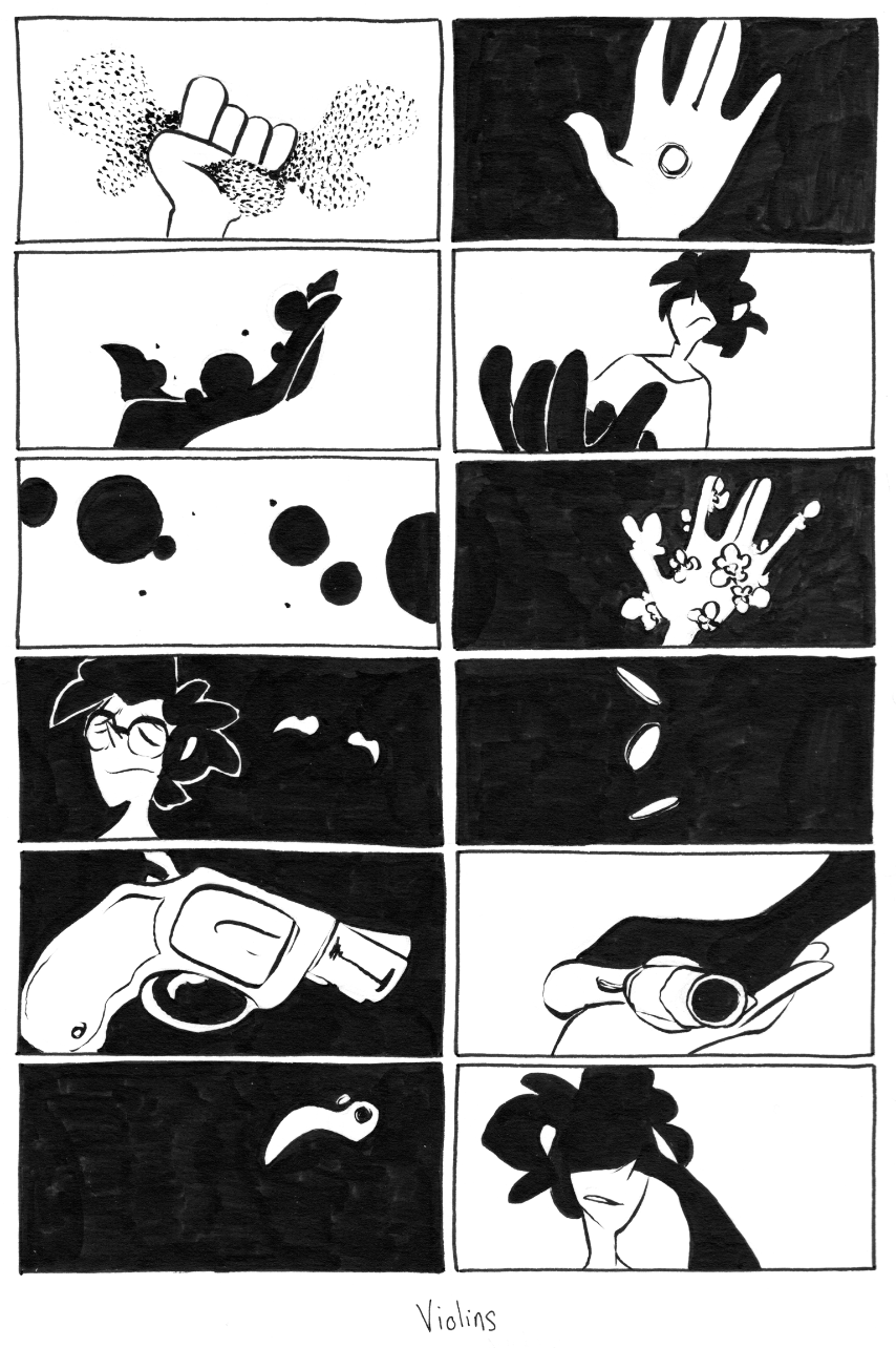
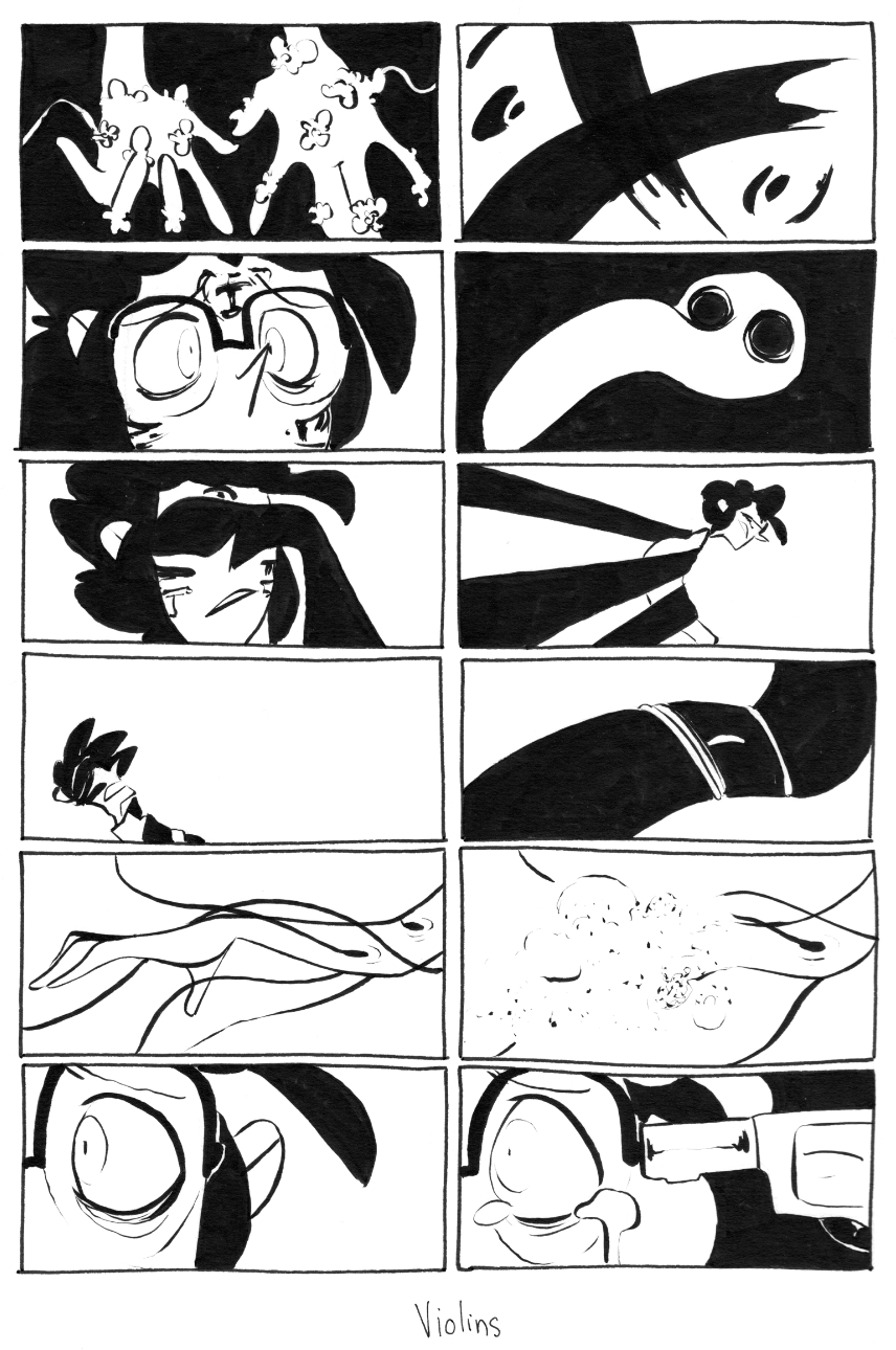
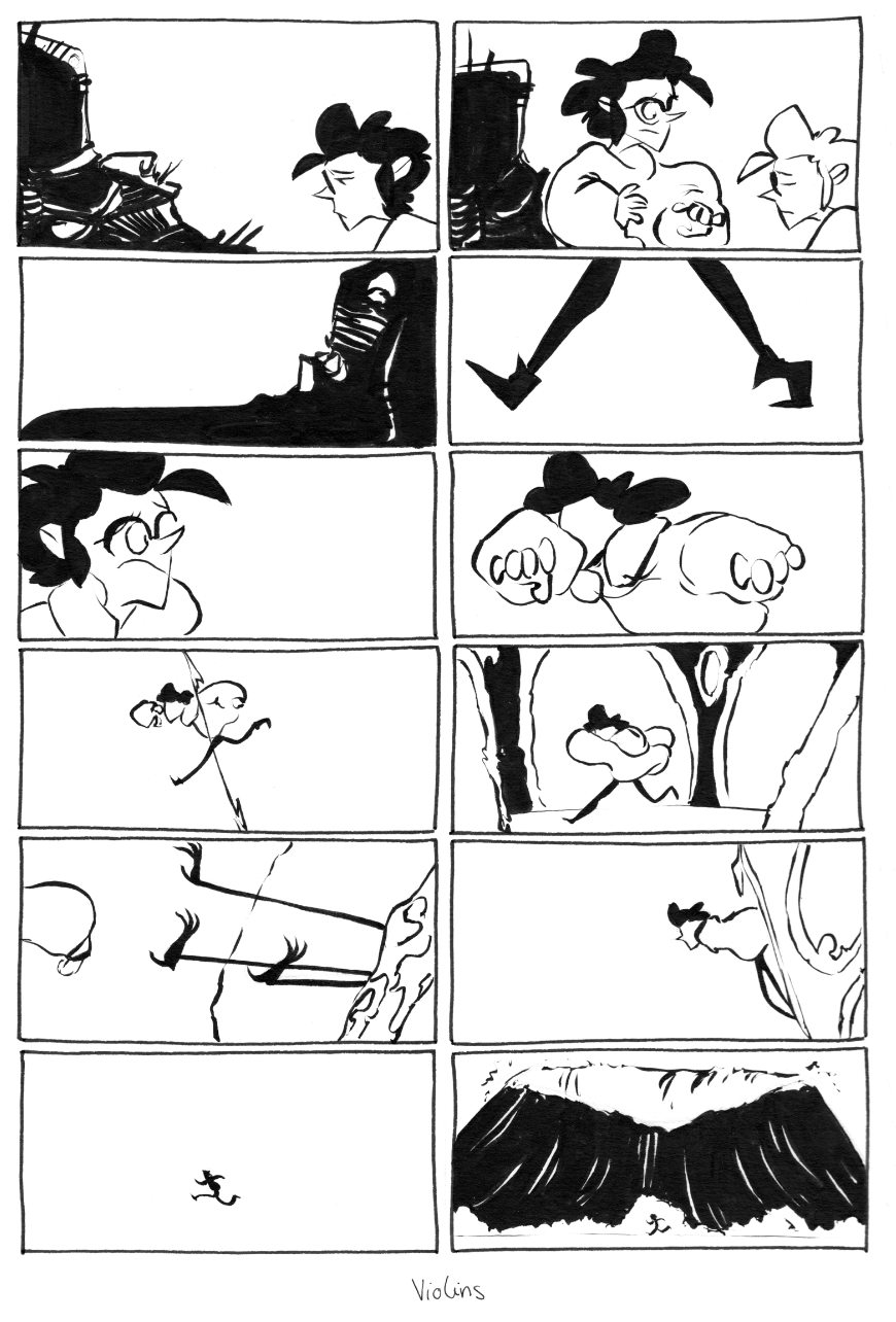
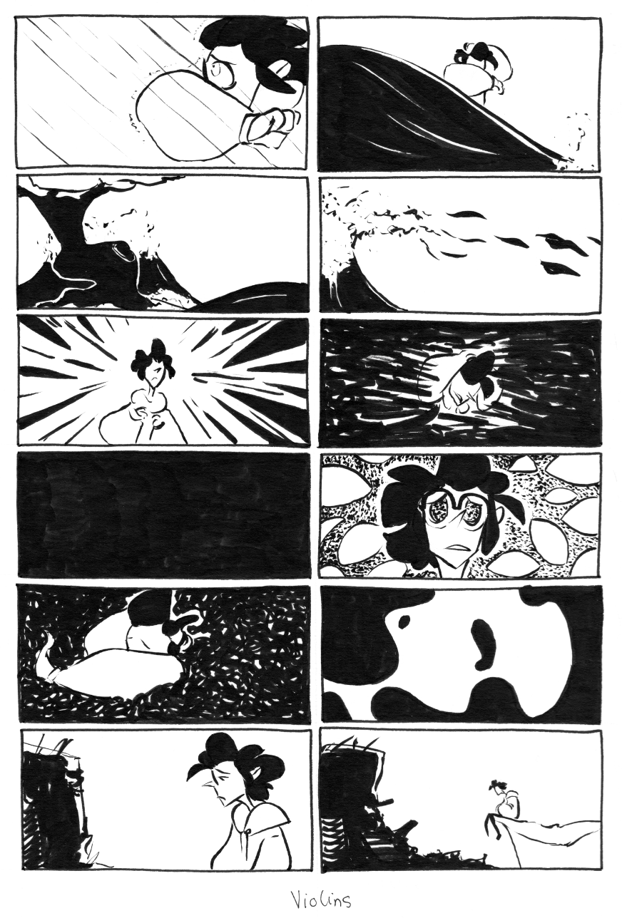
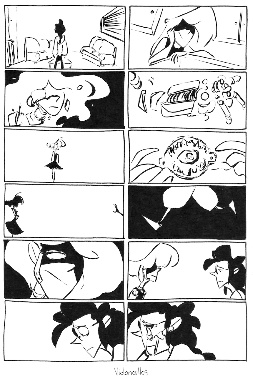
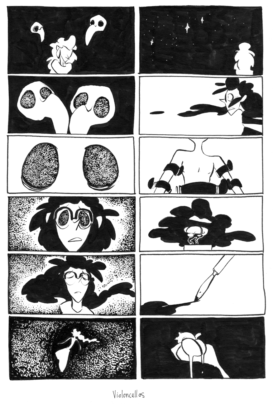
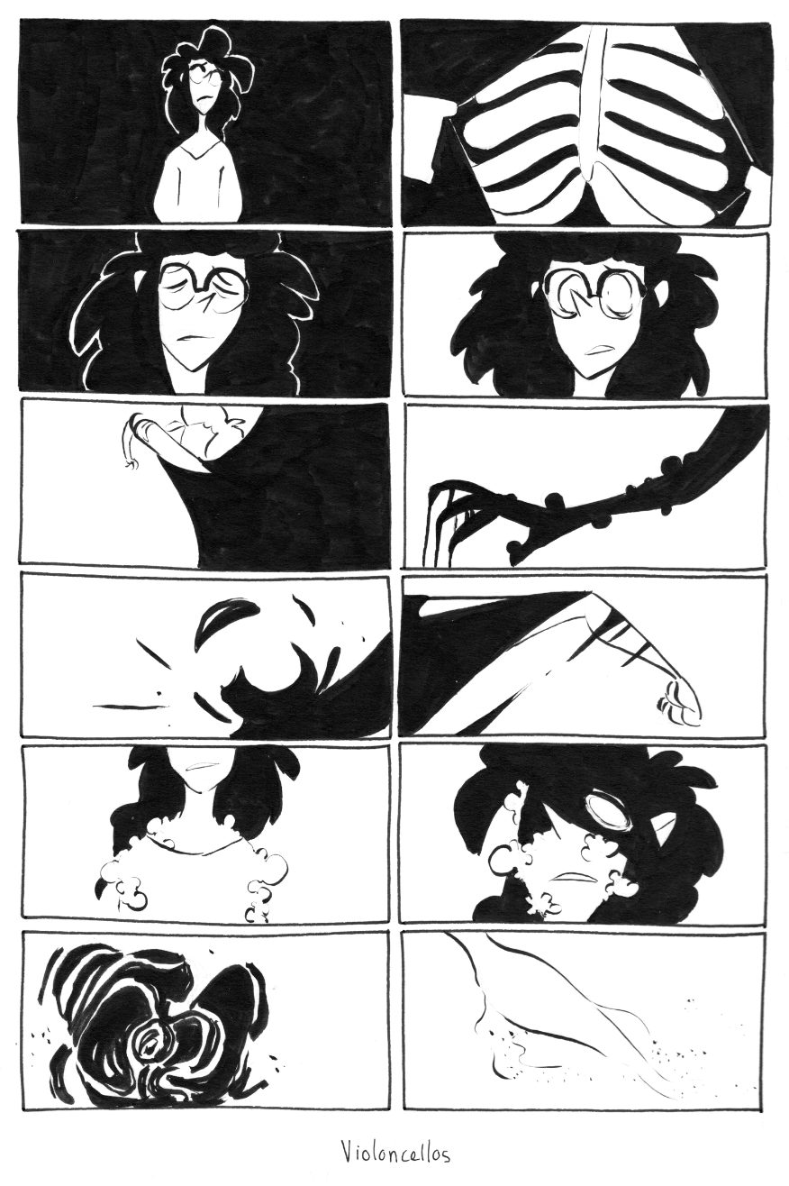
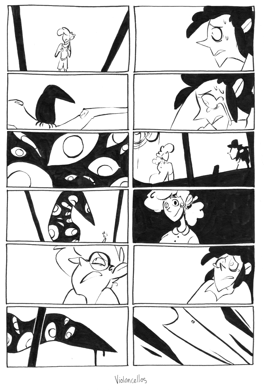
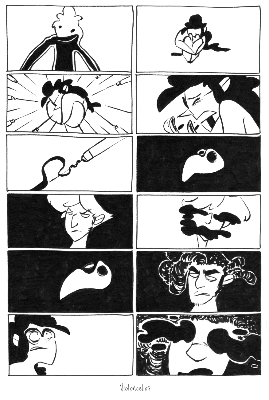
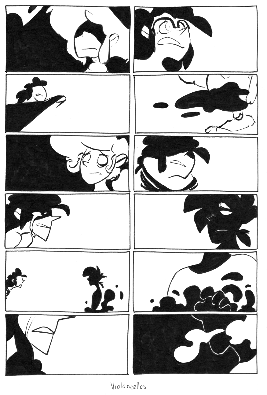
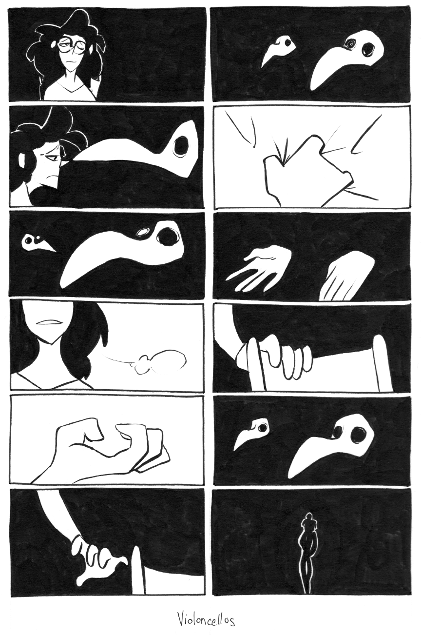
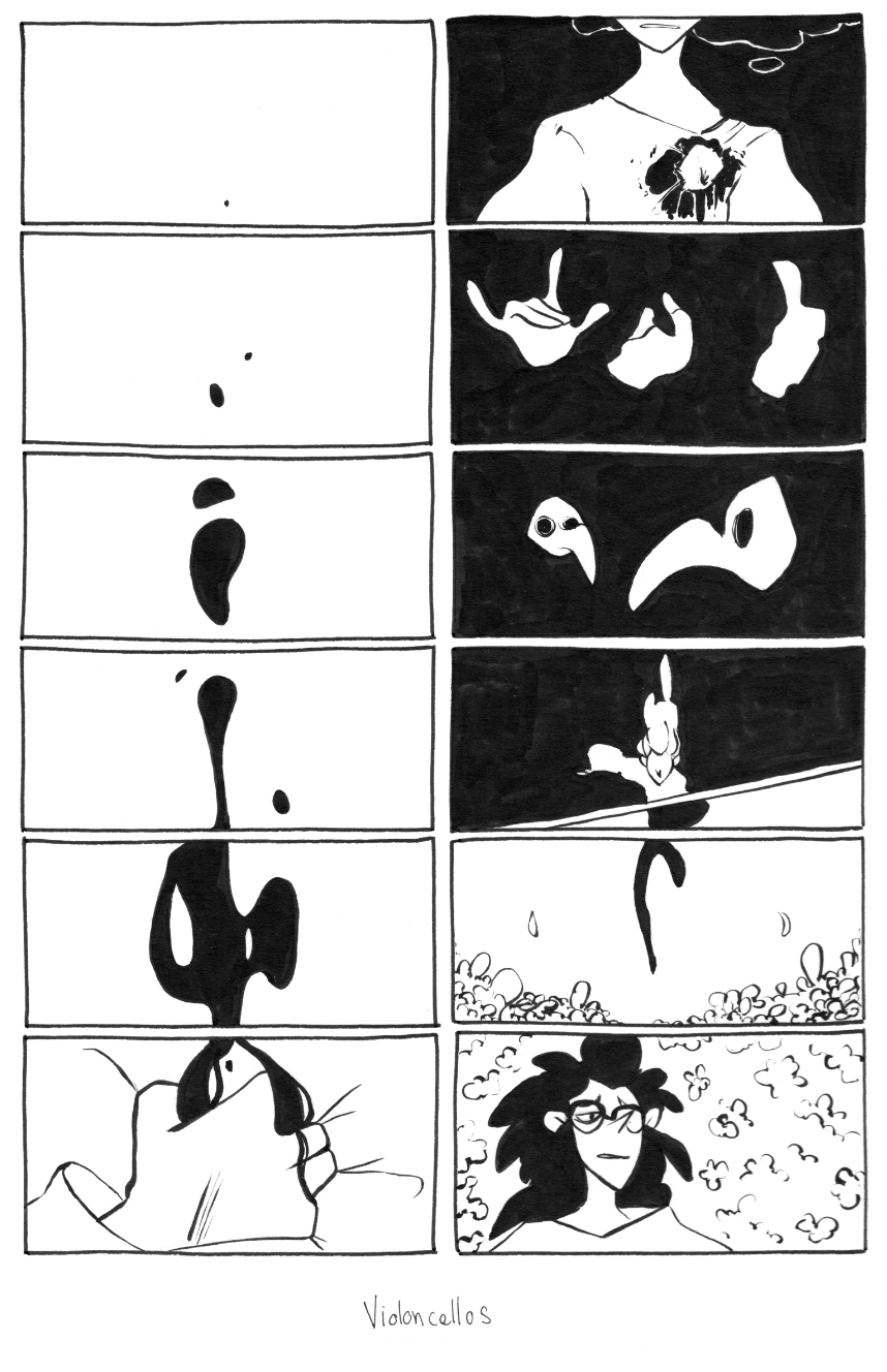
Clipped from the context they serve none of these images make any lick of sense but ouf do a lot of these make me really happy. I’m especially fond of that gripping hand with the blood pooling out of it.
The concept behind this was to build some sort of ‘film reel’ along the edges of the book as the scenes were playing out. The final result … didn’t pan out so pretty but this is an effect I definitely would like to bring back in the new version of the story. I think the strongest ones in this bunch are the ones that veer more into aesthetic or really strong action/movement and abstract composition. The ones that attempt to be too detailed lose some of the movement and flow. There could also definitely be a lot more ‘subtle’ motion ones that would generate more images and really build anticipation of the events. It wasn’t a bad idea by any stretch but the execution was a bit timid in hindsight! It’ll be back somehow!!
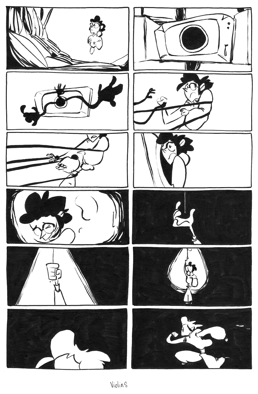
The last style of illustration really let me flex both my inking and detail prowess and these were full page illustrations which looked like this:
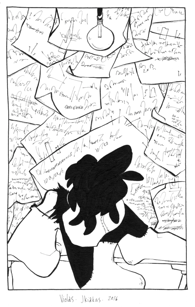
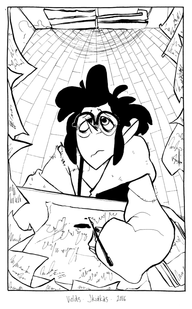
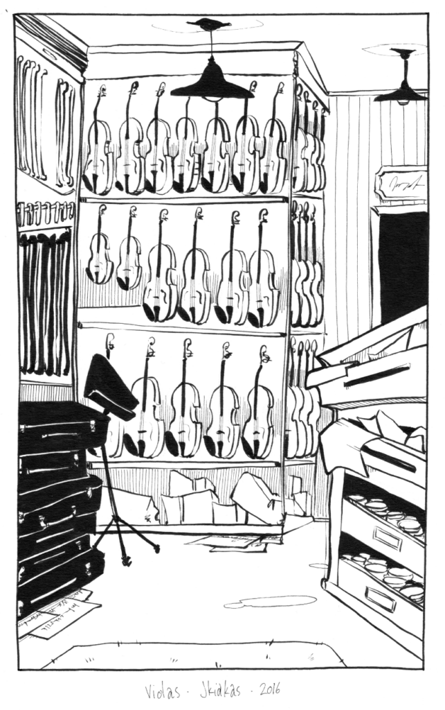
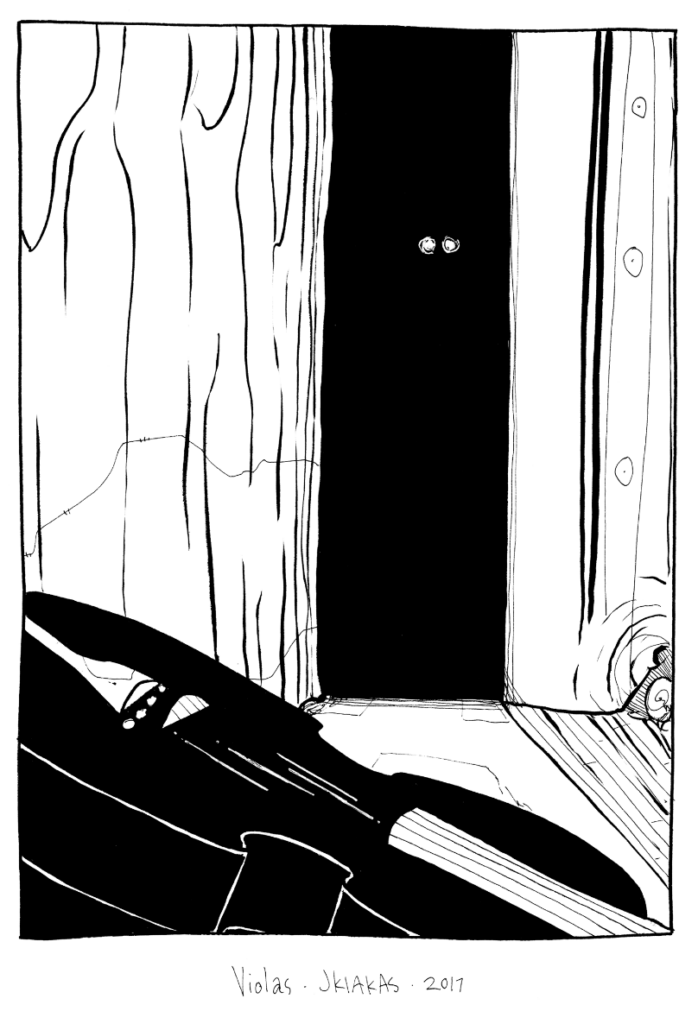
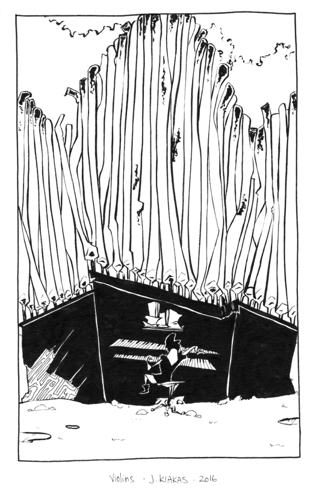
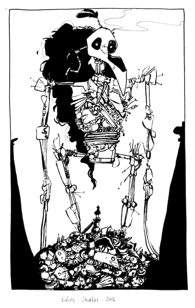
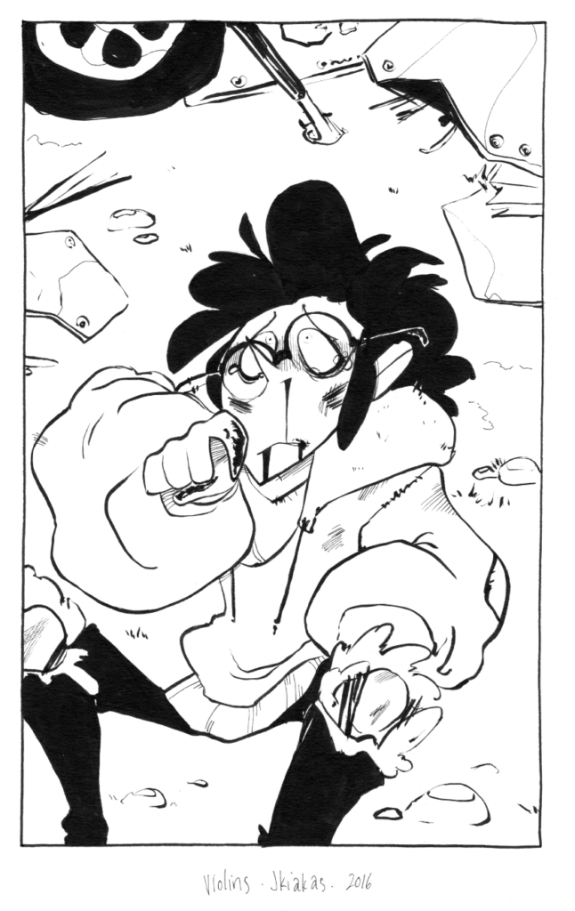
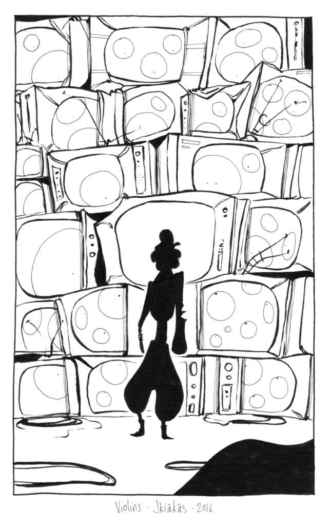
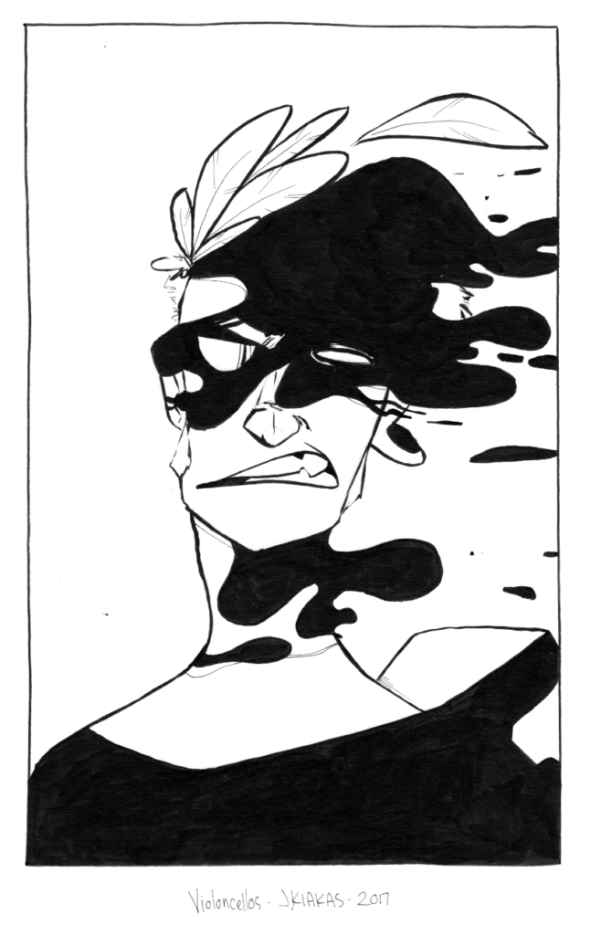
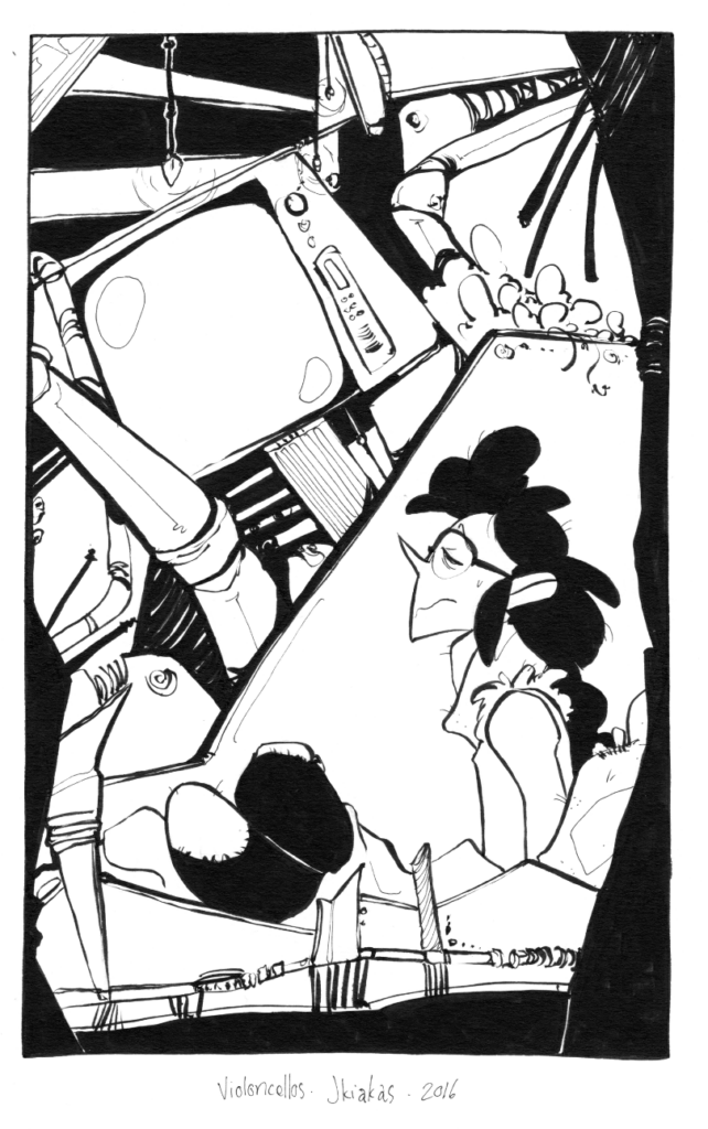
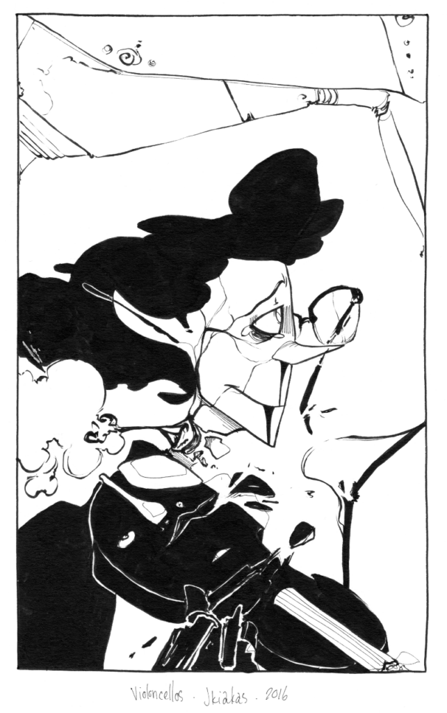

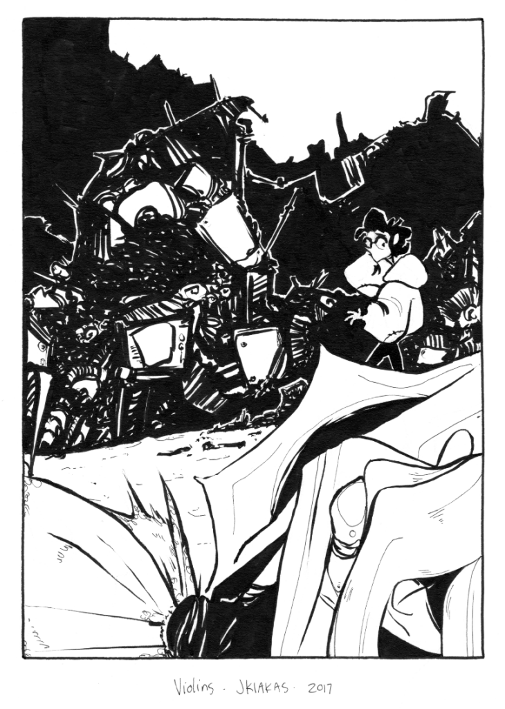
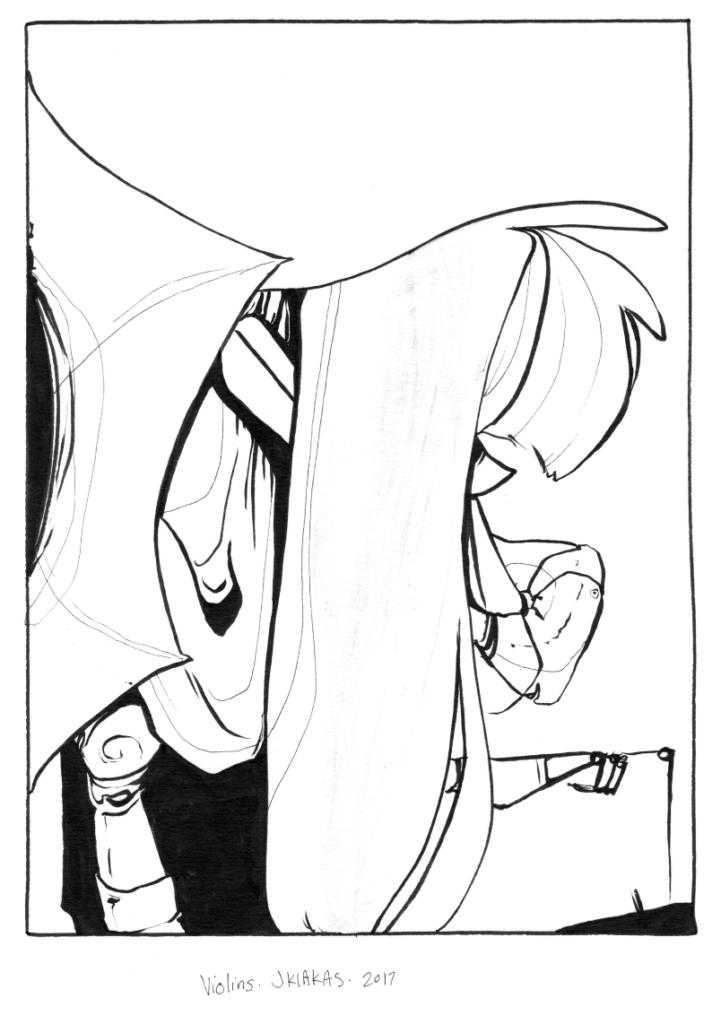
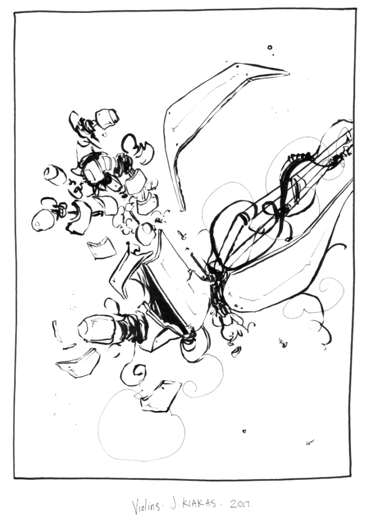
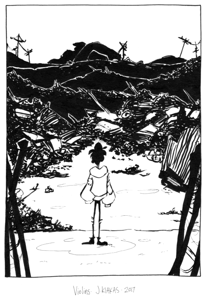
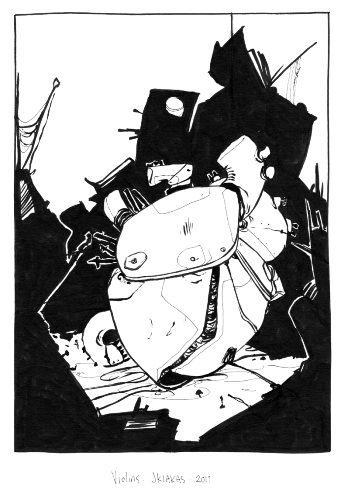
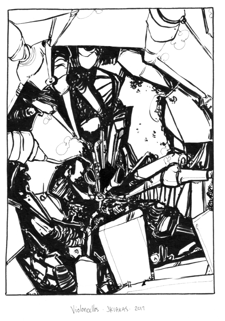
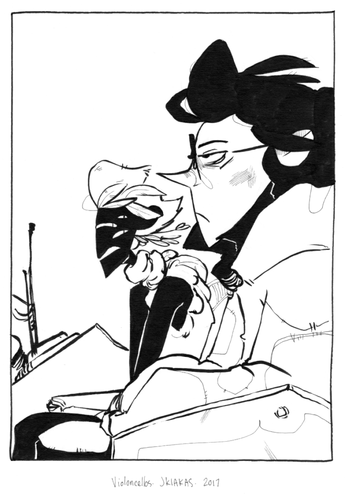
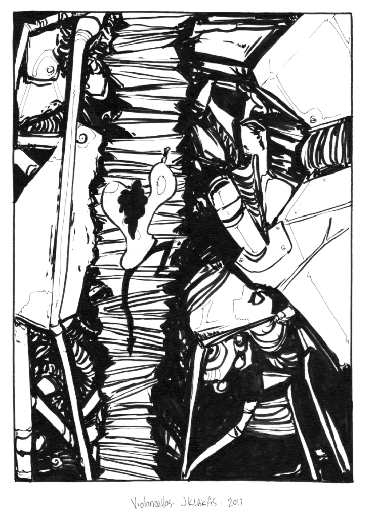
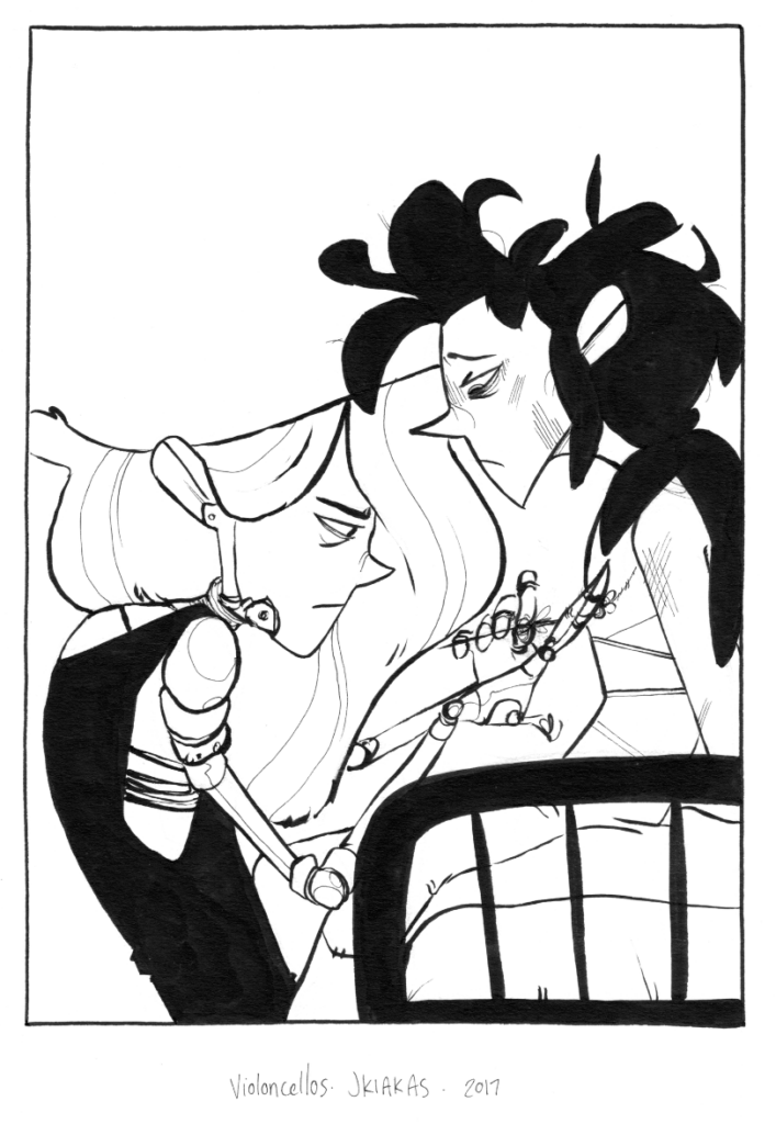
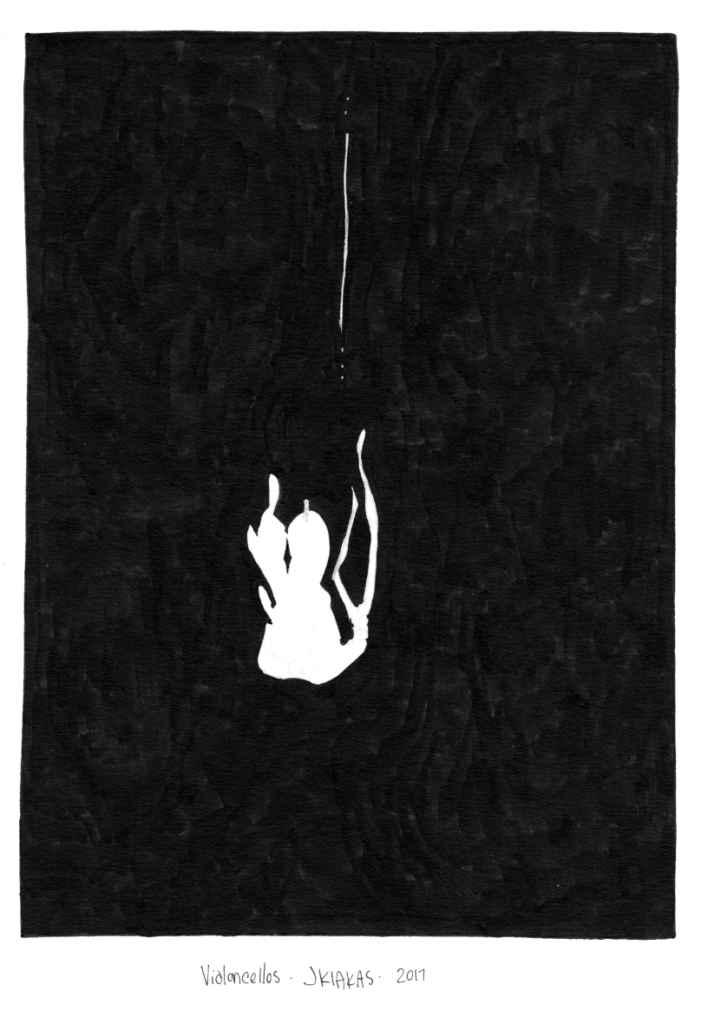
Looking back on these straight up has me itching to pick up a brush pen again and get back into traditional inking. Some of these have some of my best linework and composition its unreal I am still so extremely happy with them. I’m having a hard time committing to whether or not I’ll redraw them for the new story or try to splice these illustrations in somehow. Or if I should even commit to a new version of the story.
And yet, and yet, I sit here on a 2,000 word start to a new draft of this story, knowing that with each iteration it comes closer and closer to the vision I’ve always seen it to be. Maybe this new version will be its last iteration, maybe 7 years later I will want to rewrite and redux this thing as the eternal changing nebulous story that it is. Whatever the case I’m just committing to my truth at this point and doing what makes me happy.
And what makes me happy is how fantastic these new lines are, hoo boy~
Oliver Sanswicky is a person whose name means very little without his history and his future attached to it, but his present involves him sitting in a much-too-small closet at a much-too-small desk with a pen dripping ink and blank sheets of paper before him. He sits and thinks and waits for words to come to his attention but finds that they all sit at the tip of his pen dripping droplets of black onto white.
Oliver Sanswicky is a strange little sort with black bird feathers where most would have hair, round spectacles for small nearly-blind eyes and a tongue that never once worked a day in his life. He is not a character known for making much sound. He watches as the droplets of ink create a larger puddle against the white canvas of his paper, eyes dilating as his mind drifts…
Oliver Sanswicky is no longer a violinist but he did once play long ago. He isn’t much for keeping time as time slips through his fingers faster than water, much like reality which grips him from dark places and pulls him inside them. Past the white, white pages and into droplets of black, black ink. He floats for a great deal of time and can’t help but wonder if there truly is someone calling his name…
“Oliver Sanswicky…”
Or if he’s always ever just imagining it.
The thing about things is that things never stay the same. That is, until he started living in his weird junky little house on his weird junky little hill, surrounded by a sea of everyman’s junk all around him, stretched out for miles and miles. Nothing happens up here in this quiet little place and, quite frankly? He likes it this way.
First Draft of Winter Jay’s Violins rewrite.
Oliver has a routine here, one he practices almost as though it were his own religion. He spends nights in his room where he should be sleeping on the ratty little mattress covering the floor from wall to wall. Instead he spends time thinking far too much in his nasty little excuse for a bedroom and adds to the walls covered in little scratches and scrapes made by fine-tipped pens and a panic that refuses to afford him any amount of sleep. He writes horrible little words that whirr about in his mind, yelling and screaming and punching and kicking until he puts them into reality. These walls are too tall for his four-foot stature so the writing hardly even comes close to the ceiling only a few feet higher than him.
When the sun rises and breaks into his room past the newsprint he’s plastered to the windows to block it out, Oliver emerges. His tiny, nasty, little room with walls covered in writing is left behind for some sort of meal. His kitchen is useless by standard, only a cluster of broken appliances and cupboards that hold nothing but a small bag of pumpkin seeds growing smaller every day. He loathes the day he will have to break his routine to fetch some more. Oliver hates other people just about as much as he hates his own company. He grabs a handful of these and an empty glass he fills up in the bathroom sink because his kitchen faucet has only ever run liquid black.
His bathroom is probably the most functional room in the entire house, he isn’t sure how he managed this but he has learned not to question, only to accept it graciously since he spends a great deal of his time with his face in the toilet bowl.
Then he puts thicker clothes over his thinner clothes, and starts for the back-door.


Leave a Reply